Eaze Redesign
When Eaze's 2020 brand book failed to translate from print to digital, Myself and a small team took on a comprehensive brand refresh that transformed our digital presence while preserving core brand equity. What began as a native app design/build-out evolved into a complete digital ecosystem overhaul, including the company's first design system shared between designers and developers.
My Role
Lead Designer responsible for design system creation, cross-platform implementation, and user research & testing. I collaborated with contractors, engineers, and stakeholders to navigate technical constraints and business trade offs.
Challenge
Eaze's brand book (created by an agency) excelled at print and marketing materials but felt heavy and disconnected in digital spaces. We needed to honor $100k+ of brand investment while creating an experience that actually worked for our digital-first customers. Complicating matters: Apple removed our app from the App Store multiple times within one year for violating its terms of service (using the words vape, smoke, etc), costing significant revenue and forcing us to pivot our entire strategy mid-project. We did not want to spend precious time and money building a native experience, only to potentially have it rendered useless.
Strategic Pivot
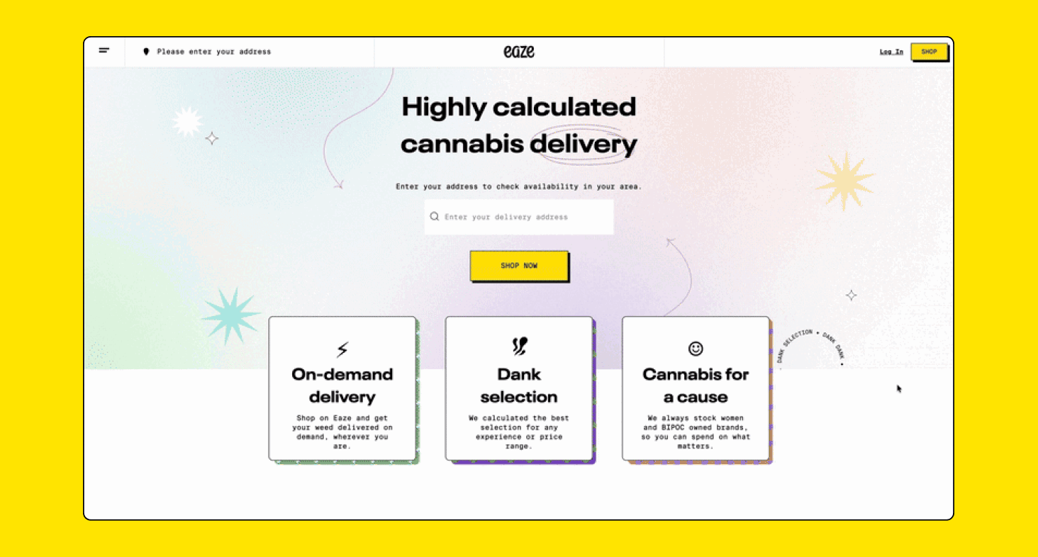
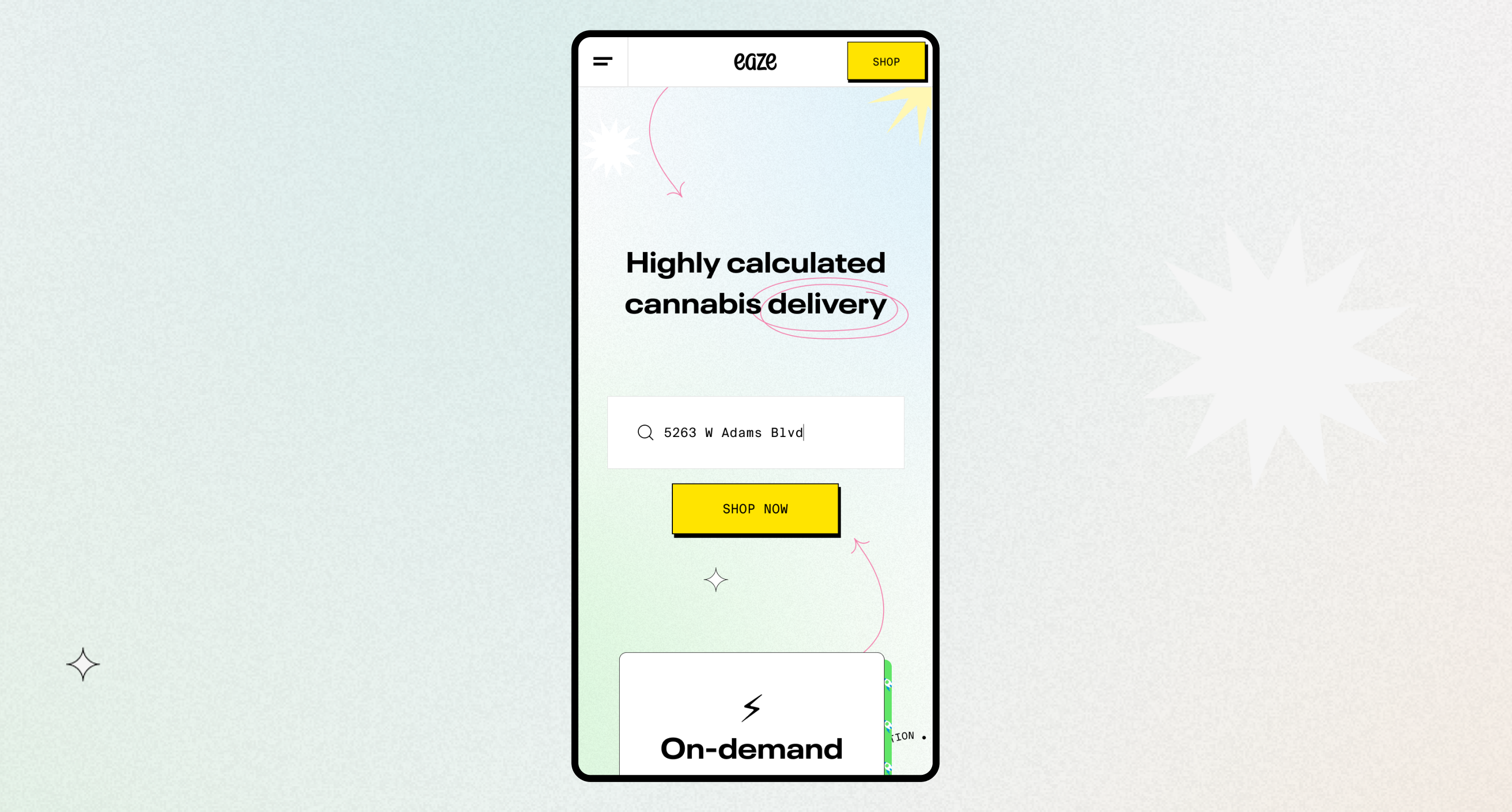
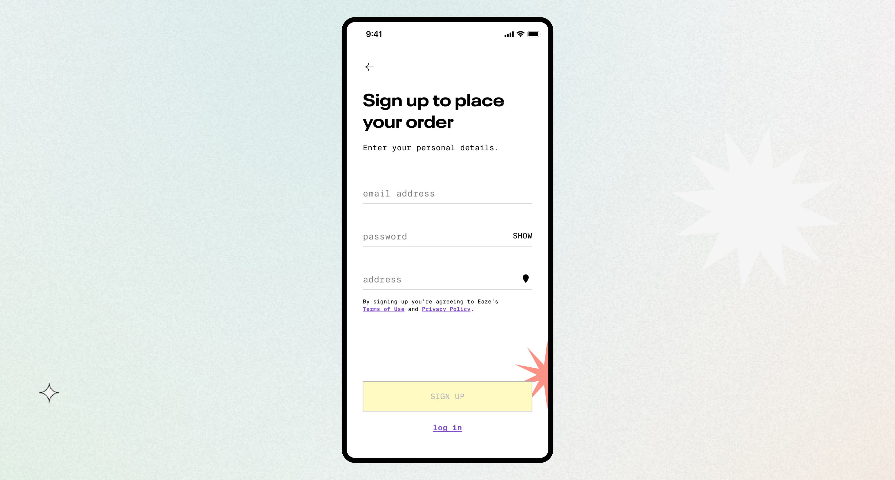
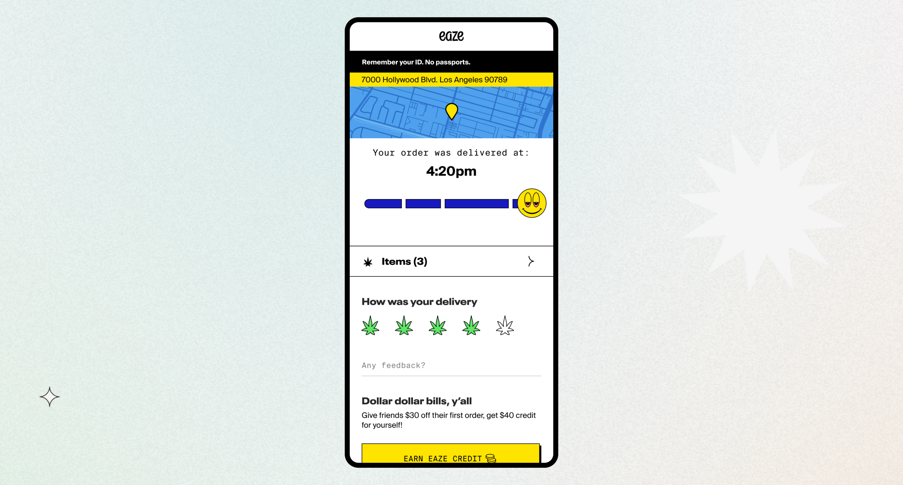
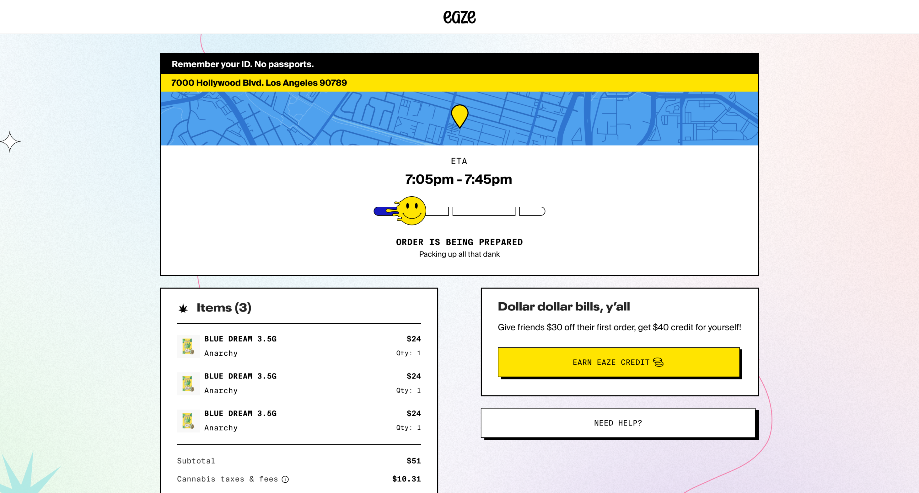
Native to web - Initially designing a completely native app experience, we had flows, prototypes, and months of work completed when Apple's repeated removals forced a critical decision. Rather than risk the time and money it would take to build a fully native experience that could disappear overnight, we pivoted to focus entirely on eaze.com, which was currently acting as the app (in a web wrapper). This meant reverse-engineering native designs for web, a surprisingly complex challenge.
Design Solutions
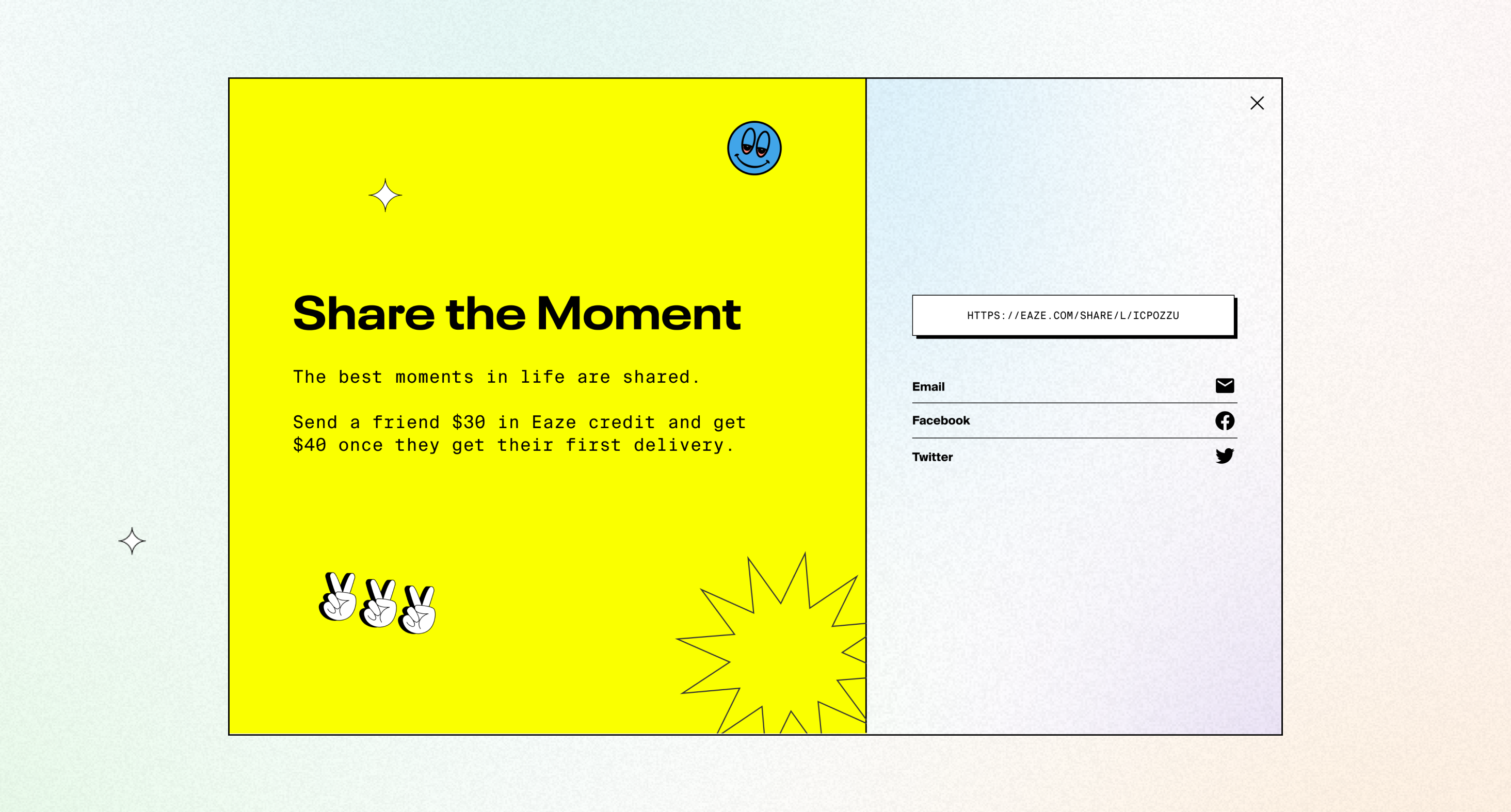
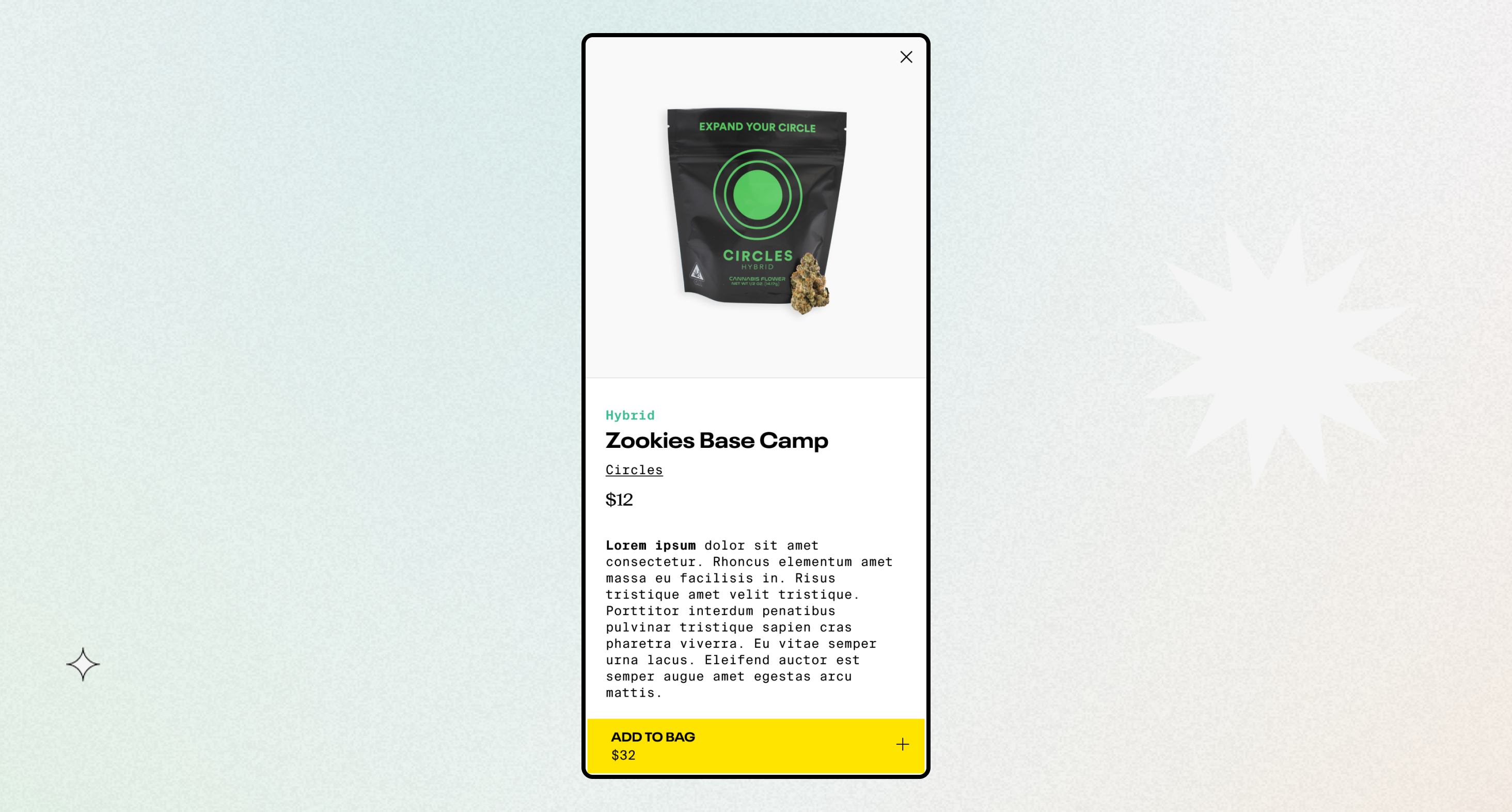
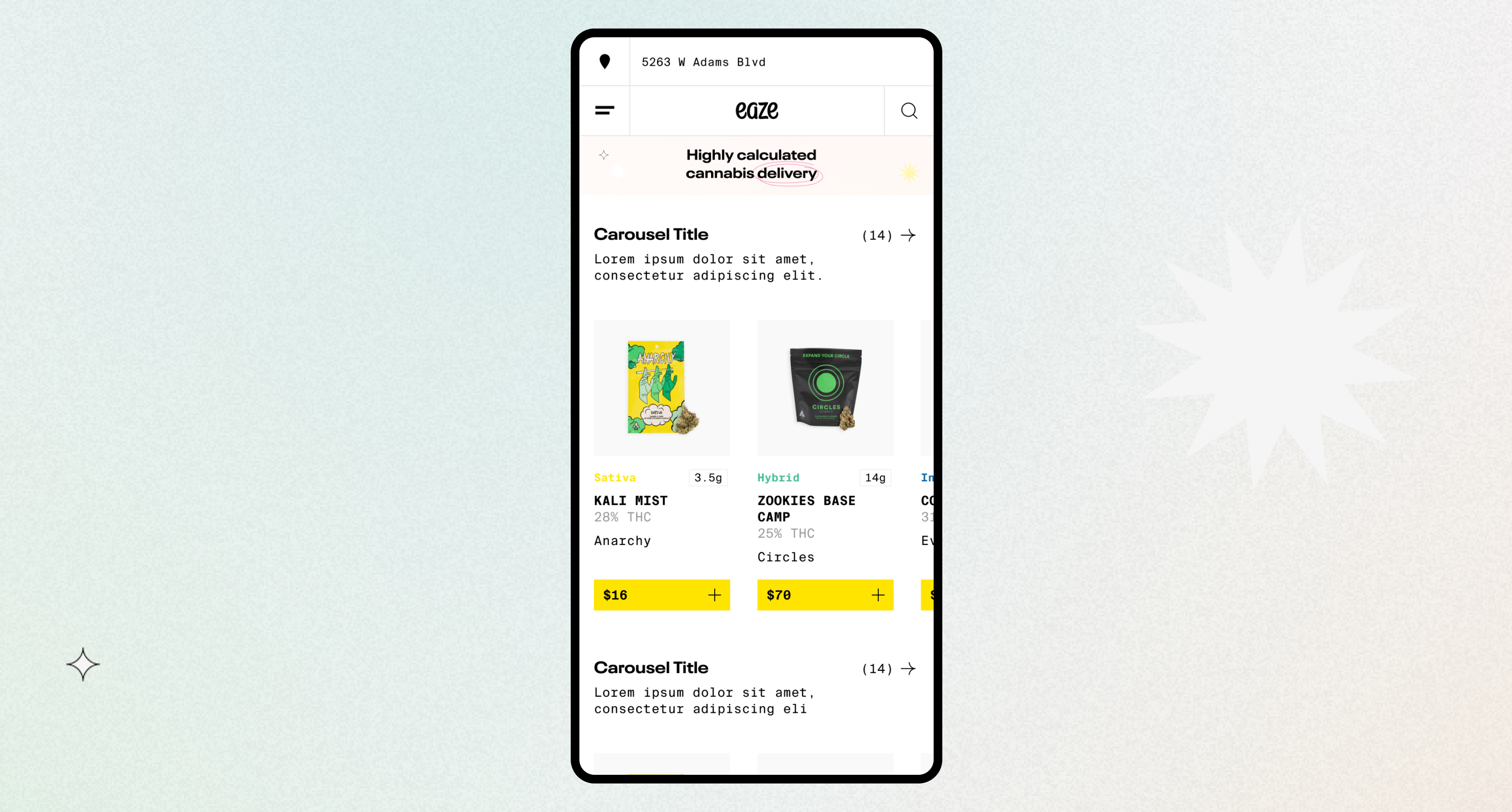
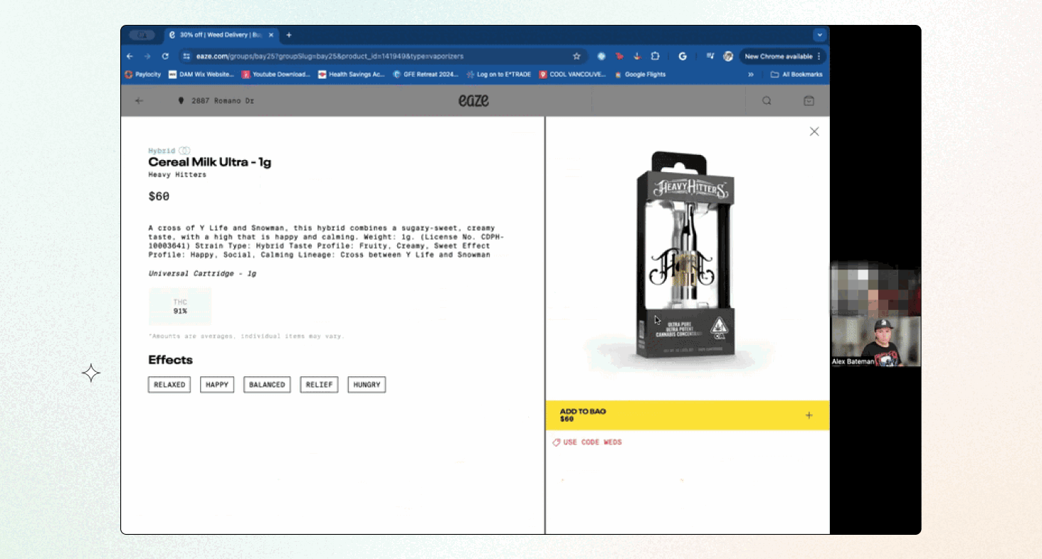
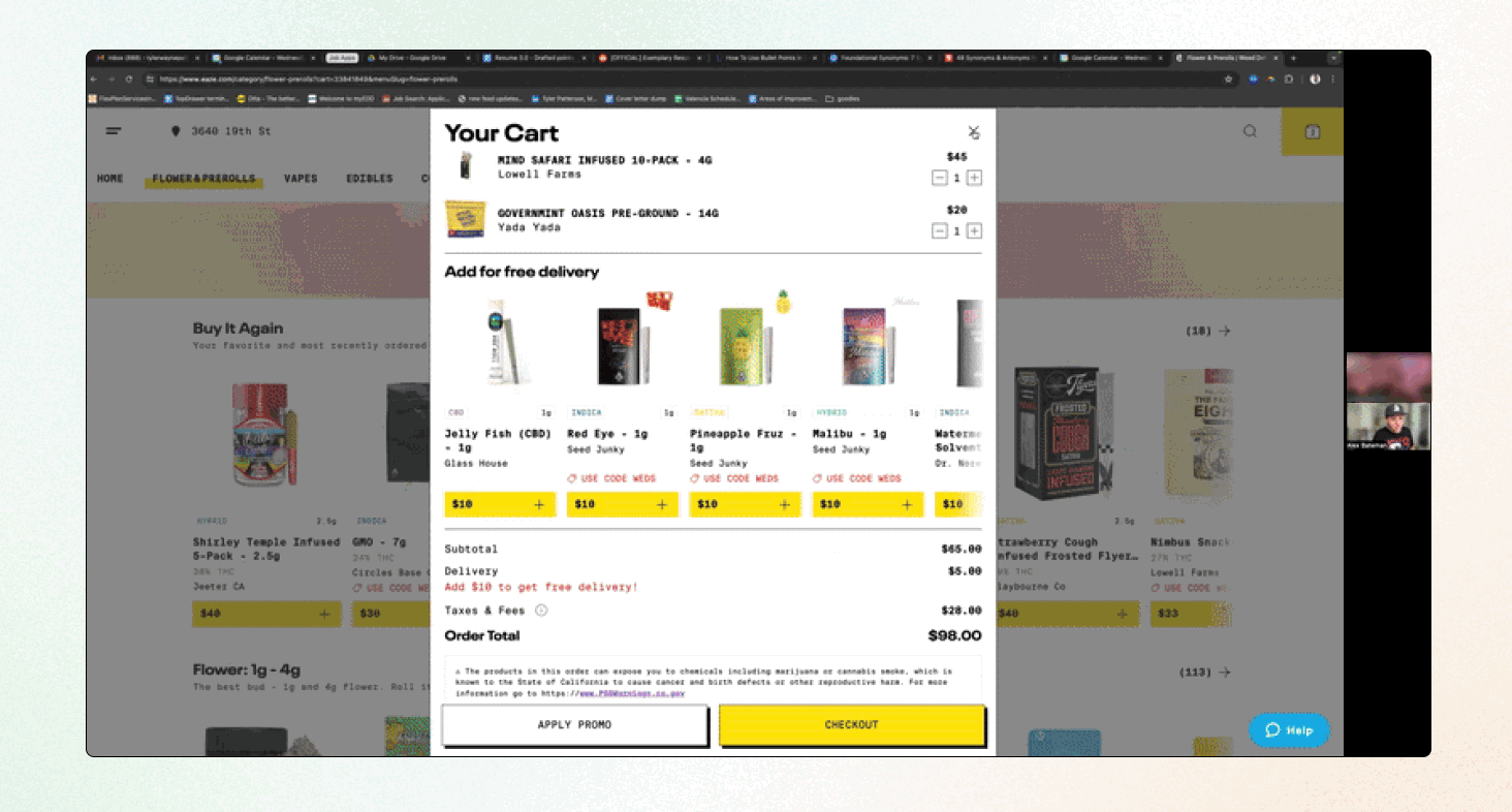
Digital first brand - We kept the core color palette, logo, brand voice, and key illustration style, but evolved the system to feel lighter and more modern. This included introducing blurred gradient treatments, adopting Neue Plak Extended as the primary typeface, and running extensive tests. Design system - With no existing system for designers or engineers, I built a full component library in Figma and partnered with engineering to integrate it into Storybook. This became the backbone for rebuilding user flows and brought consistency across every platform. Phased implementation - A full UX overhaul would have taken 8 months or more, so we adopted a phased approach. First, we reskinned the existing site using the new visual language. Then we released fast-follow UX improvements after launch. I also redesigned our marketing and operations sites using no-code tools for teams without engineering resources.
User Testing
This was our longest-running user testing program to date. Throughout the design and build process, we scheduled ongoing feedback calls which was a crucial decision that uncovered UX flaws on eaze.com we had never noticed. We discovered critical issues: order cancellation buried behind three non-obvious clicks, account settings that were nearly impossible to find, and order history hidden where no one thought to look. I led these calls with my PM. These interviews became a goldmine of insights about how our customers shop, why they make certain decisions, and where we could improve their experience. We continued tapping into this user panel whenever we needed fresh eyes on smaller projects.
Cross-Team Collaboration
This project relied on tight coordination across design, engineering, and stakeholders. Throughout the build, we tackled edge cases in real time to avoid blockers and maintain momentum. Towards the end of the project we had a daily stand up to get everything across the finish line. We closed things out with hands-on QA sessions to ensure the final experience shipped was pixel perfect and worked without a hitch.
Impact
The new system created a unified digital presence for the first time, bringing consistency across every touchpoint. Our web-first approach reduced risk by keeping us insulated from App Store policy changes, and the no-code site redesigns gave marketing and operations teams way more independence. The modular structure also set us up for fast feature launches and long-term growth.
Reflection
This project reminded me that the "perfect" version of an idea almost never makes it all the way to the finish line. Once you're up against real constraints like Apple's rules or limited resources, you have to adapt. Leaning into those limits actually helped us build something stronger and more flexible than the original concept. Taking a phased approach delivered quick wins, gave the team confidence in the direction, and opened the door for bigger UX investments later on.