Float (branding + website)
Root Beer Club needed a brand identity for their delivery-only root beer float franchise model. Float would enable home-based franchisees to operate delivery kitchens through DoorDash, requiring a visual system that worked across digital platforms and physical packaging. I led the complete brand creation from concept through implementation.
My Role
Brand Designer responsible for visual identity, packaging design, and web experience. Created all hand-drawn illustrations, developed the brand system, designed physical packaging with production constraints, and built the website architecture for phased feature launches.
Challenge
Root Beer Club wanted to expand beyond their subscription service into a franchise model that didn't exist yet: home kitchens becoming commercial float shops. The brand needed to appeal to both children discovering floats and adults rediscovering them, while maintaining connection to Root Beer Club without dilution. We had to create trust in a new business model while making it feel as familiar as a neighborhood soda shop.
Key Insight
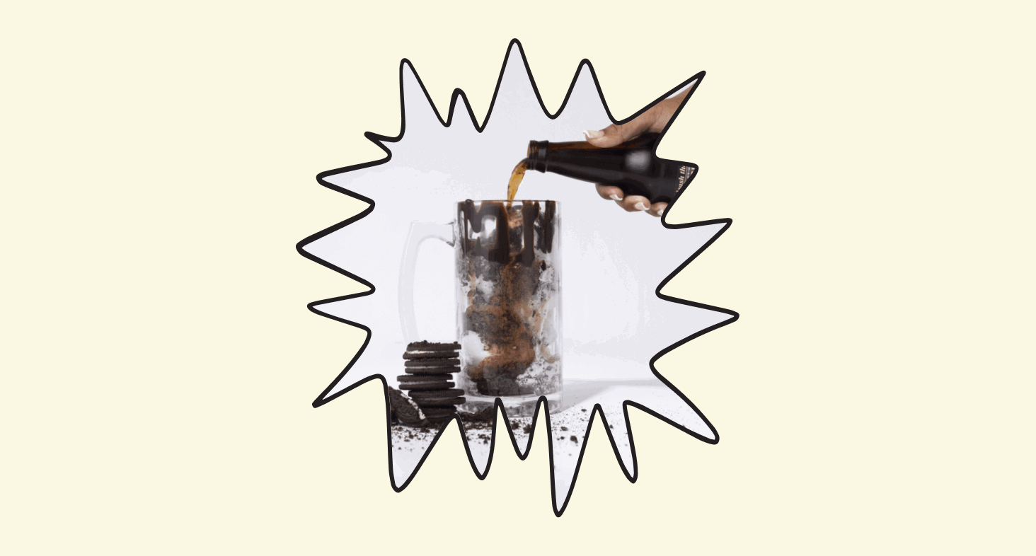
The magic came from mixing nostalgia with something fresh. People weren't just ordering floats, they were buying into a feeling that connected different generations. The brand needed to feel handmade and personal in a world where everything else feels auto-generated.
Design Solution
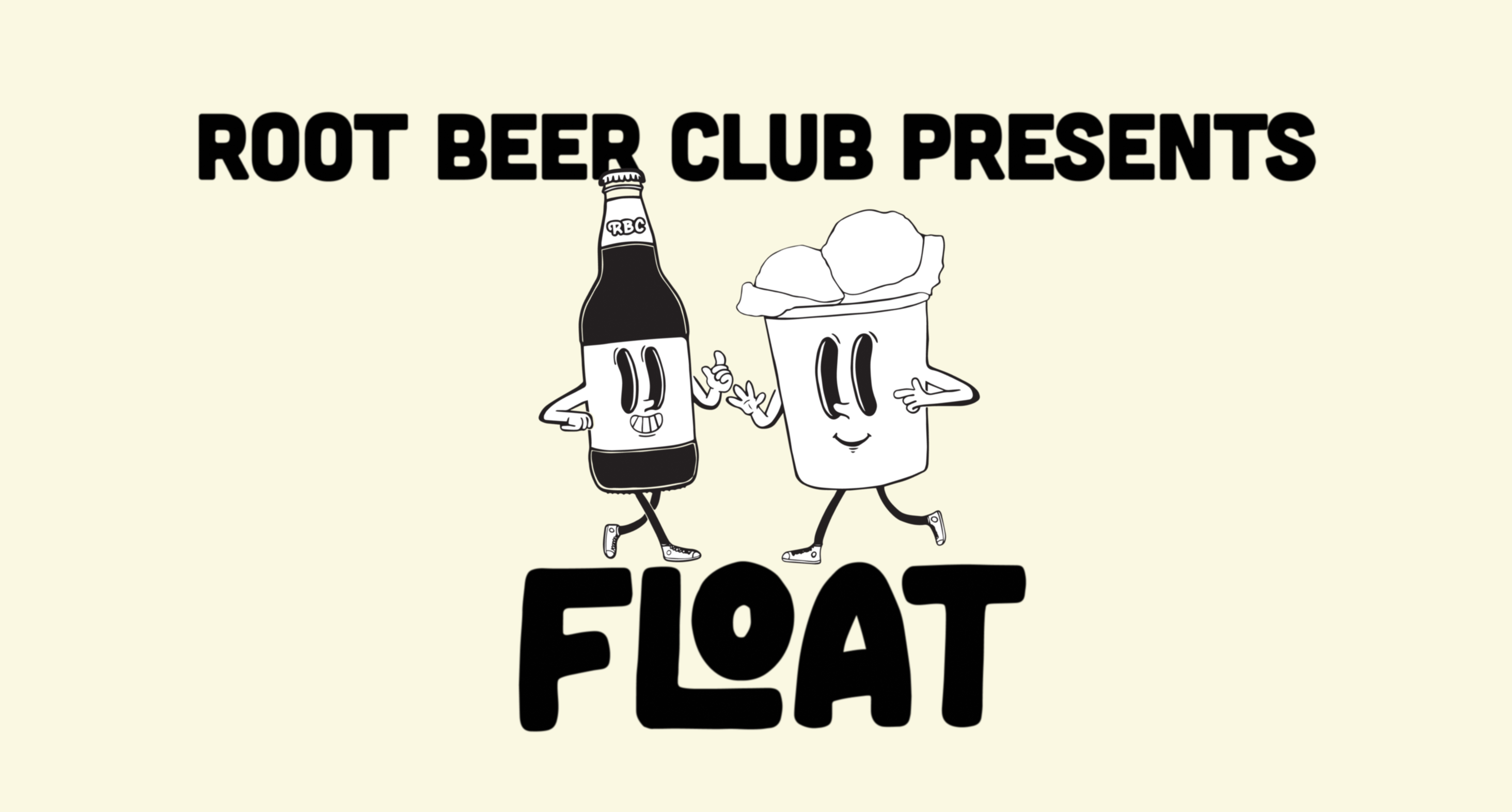
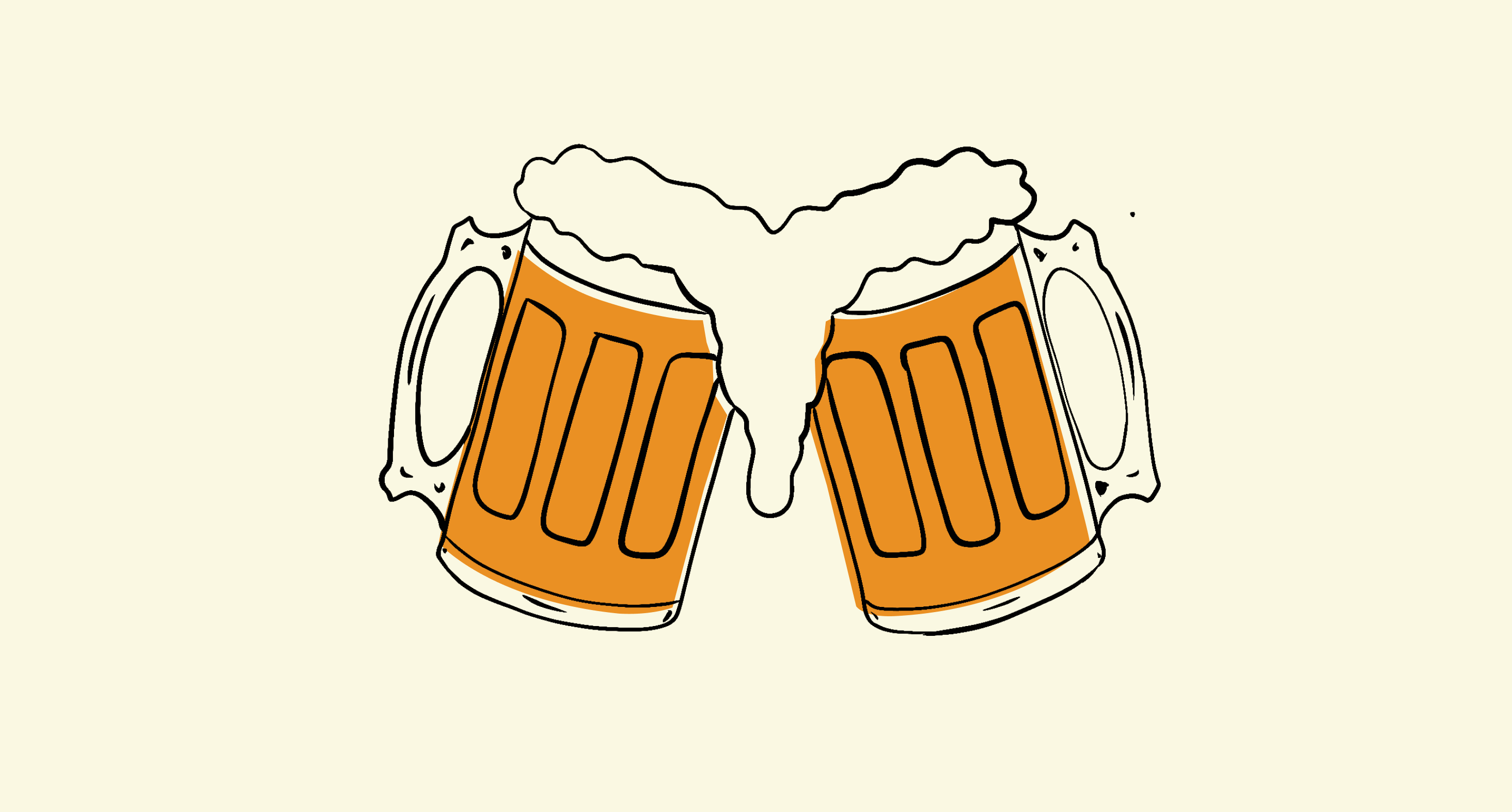
I developed a completely hand-drawn visual system centered on anthropomorphic characters that felt lifted from 1950s soda shop windows. Every element was illustrated in Procreate, creating deliberate imperfection that gave the brand humanity.
The core design system included:
- Custom hand-lettered typography
- A root beer bottle mascot with distinct personality appearing across all touch points
- Warm orange palette inherited from Root Beer Club
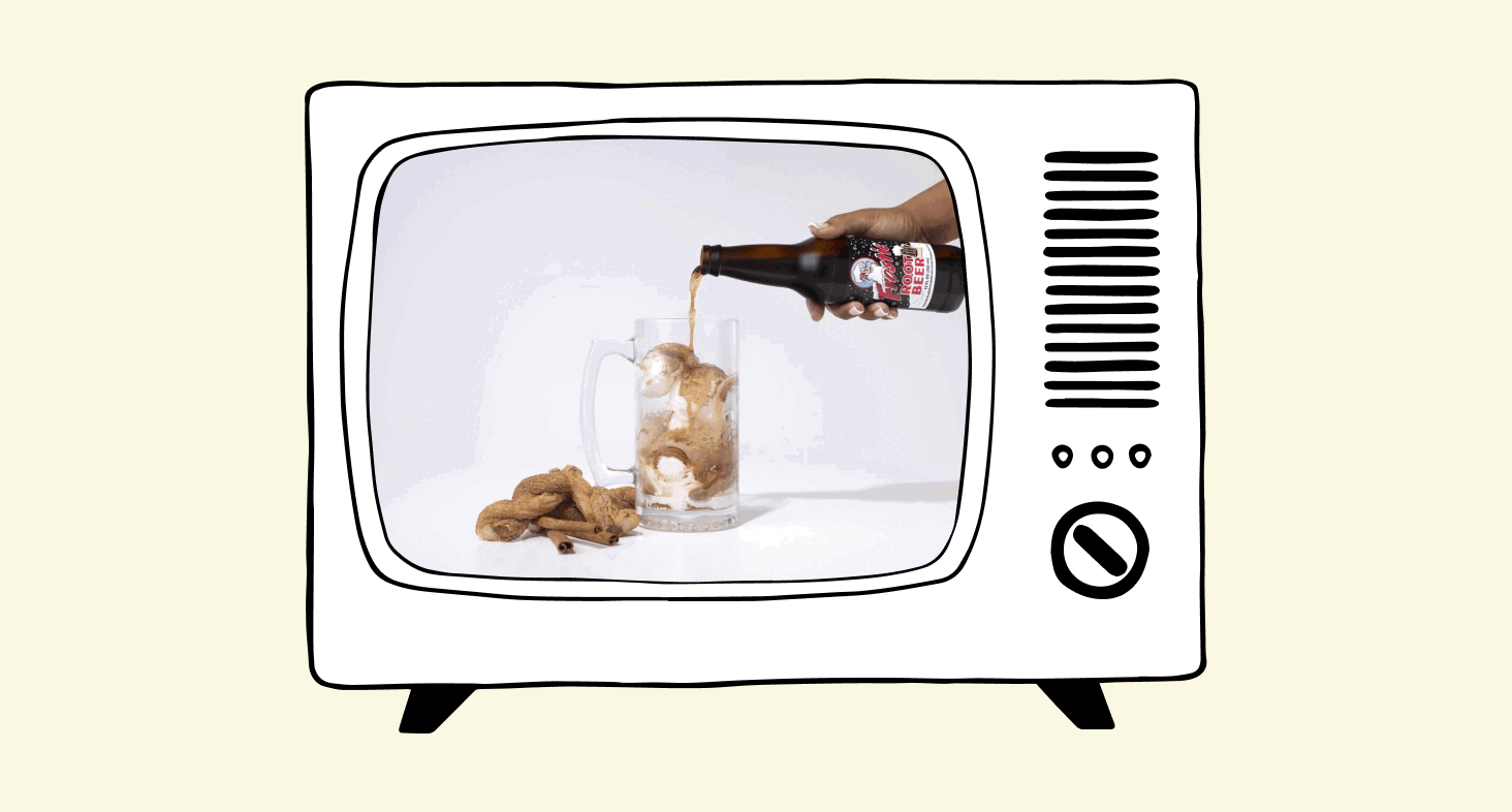
- Steamboat Willie inspired animation & illustration style for digital applications
- Vintage American aesthetic enhanced with modern delivery context
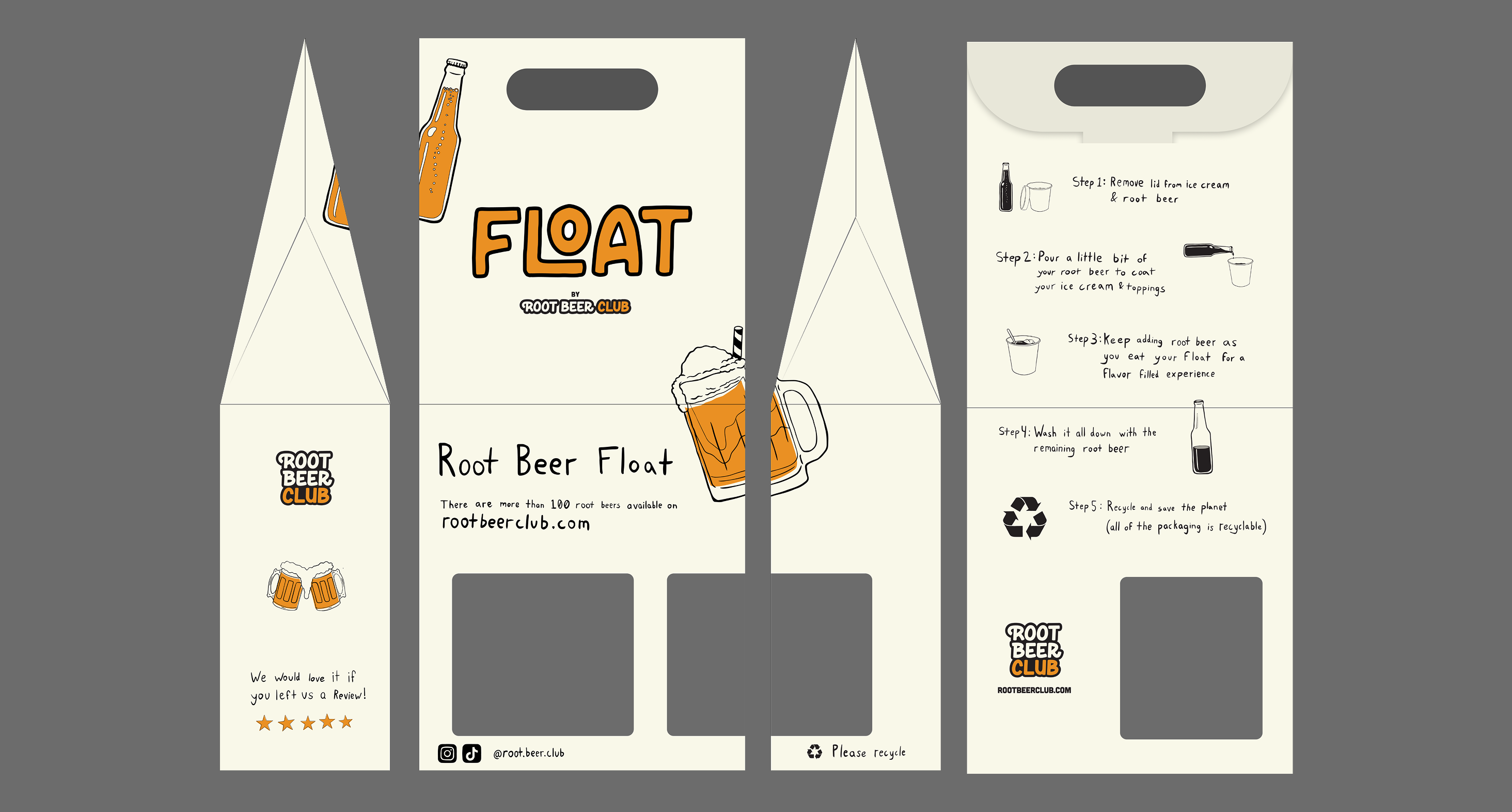
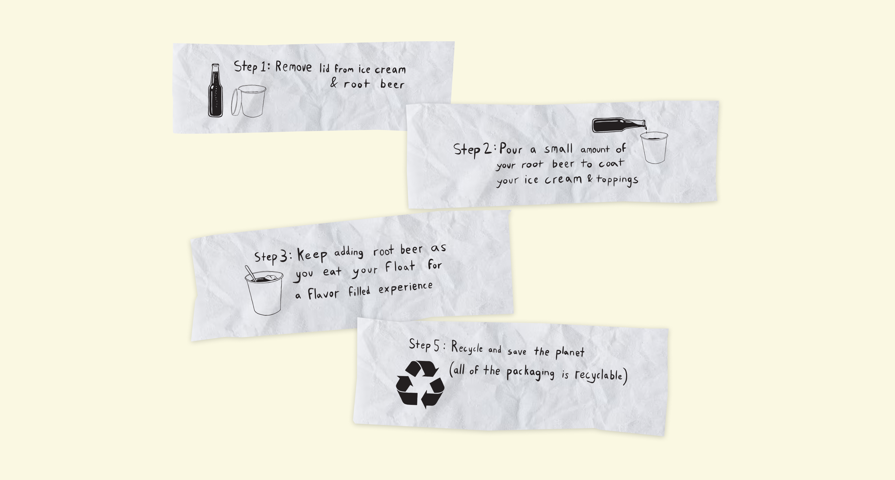
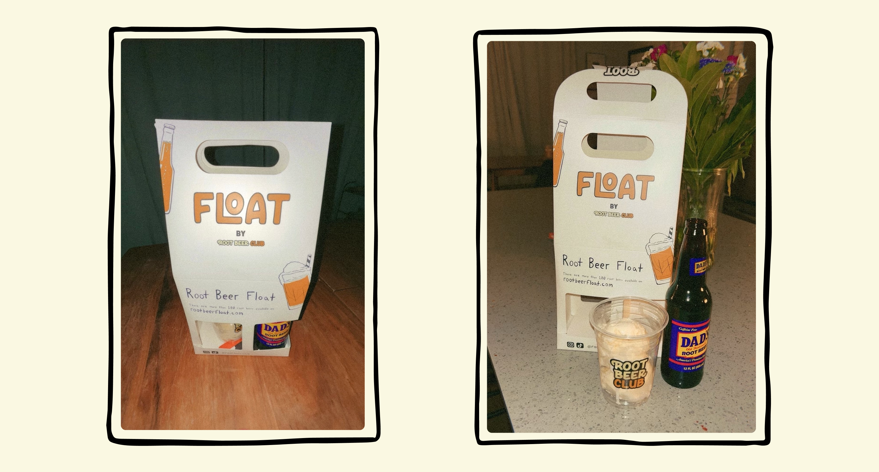
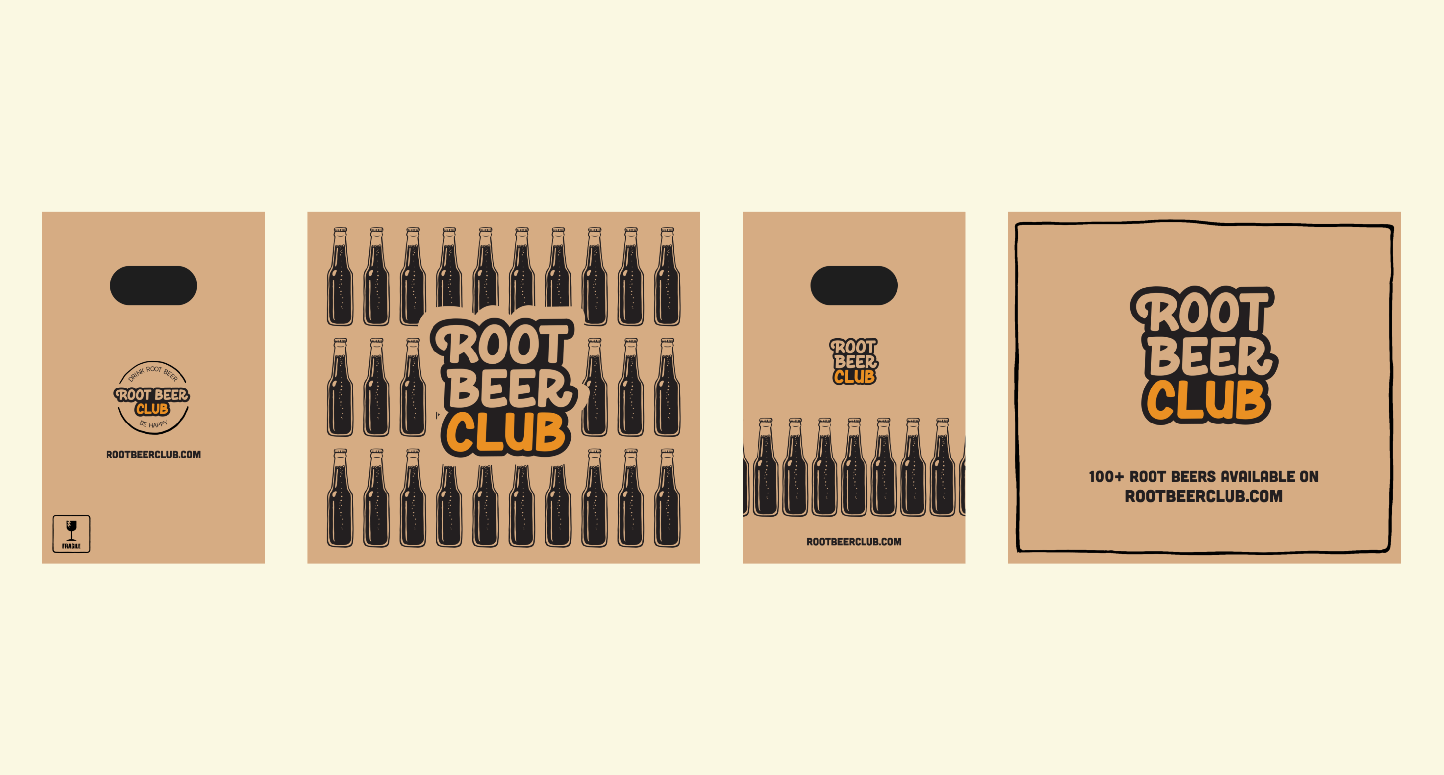
Physical Design & Digital Implementation
The packaging presented unique challenges after a decade designing purely digital products. The subscription box required mapping UPS label zones, accounting for tape placement, and designing an unboxing journey that delighted before revealing contents. The Root Caddy became our hero piece. It is a carrier protecting glass bottles while educating customers through hand-drawn instructions on "making the perfect float."
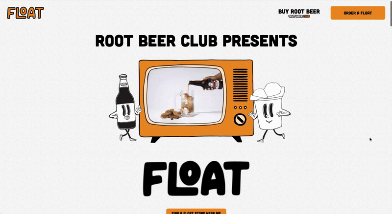
The website had two purposes:
- Phase 1: Customer-facing DoorDash connection (launched immediately)
- Phase 2: Franchise recruitment pages (designed but hidden until business readiness)
- SVG animations maintaining crispness across screen sizes
- Typography systems balancing legibility with hand-lettered character
- Mobile-first approach preserving personality despite space constraints
- Hidden franchise infrastructure ready for activation without rebuild
Process Highlights
The transition from digital product design to physical packaging forced new considerations. I re-learned everything I had forgotten since my freshman graphic design class about packaging design, understanding die cuts and bleed requirements. Each iteration went through both digital prototyping and physical mockups. The hand-drawn approach meant hours in Procreate developing a library of reusable elements while maintaining the spontaneous feel.
Reflection
Working within all these different constraints ended up shaping the work in the best way. Keeping the existing colors, designing for both digital and physical pieces, and navigating the franchise model all pushed the brand in a more intentional direction. In the end, the limits helped the design land somewhere more interesting and true to the experience we wanted to create.