Jenzy Fit Quiz
Jenzy eliminates guesswork in children's shoe shopping by providing accurate sizing across every brand and style. When data revealed that a simple fit quiz we crafted outperformed our photo scanning technology, I led the design's transition that made the quiz the core of the sizing experience.
My Role
Lead Product Designer joining at the end of the discovery phase. I was the only full-time product designer at Jenzy. I partnered with the PM and engineering team to design, test, and launch the new fit quiz across web and mobile platforms. Conducted extensive user research, created the interaction design, and established a continuous improvement system post-launch.
Challenge
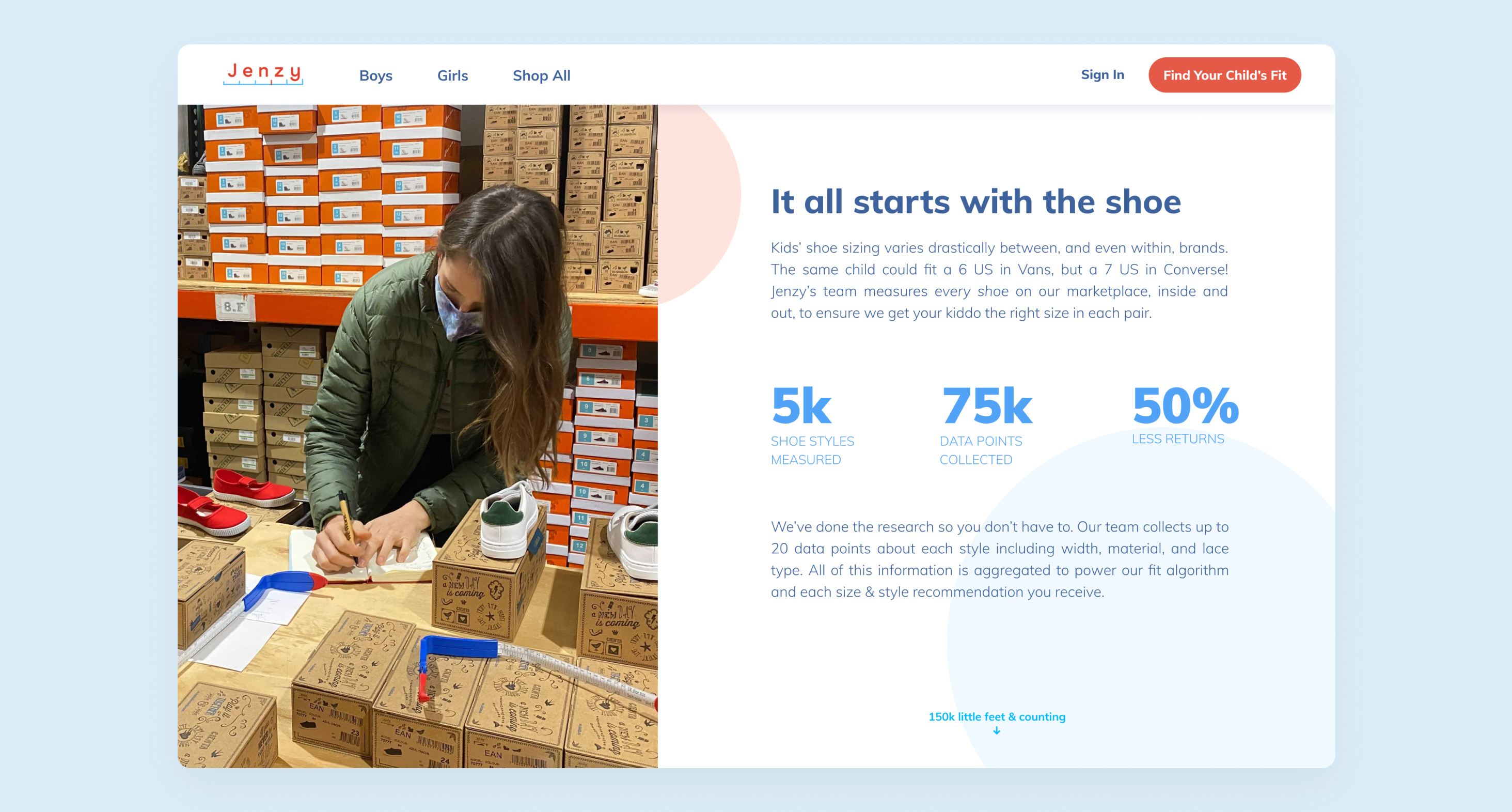
Jenzy's original photo scanning method required parents to photograph their child's foot next to a reference object like a library or credit card. After a year of parallel testing, the data was clear: our hastily-built quiz delivered more accurate results, had 2x higher completion rates, and was actually preferred by parents who found answering questions easier than wrangling kids for photos.
The challenge was deprecating our highly marketed photo feature—the technology we'd built our brand around—and elevating a basic quiz into something worthy of being our primary sizing tool. All of this without losing user trust.
Research & Discovery
I spent my first weeks immersing myself in a year's worth of accumulated insights. Mixpanel data showed that users who completed the photo scan often didn't trust the results and ended up using the quiz anyway. User interviews confirmed the quiz was faster, less frustrating, and simply easier to complete while managing a child. The core of the problem wasn't technology; it was a mismatch between our complex solution and a parent's desire for speed and confidence.
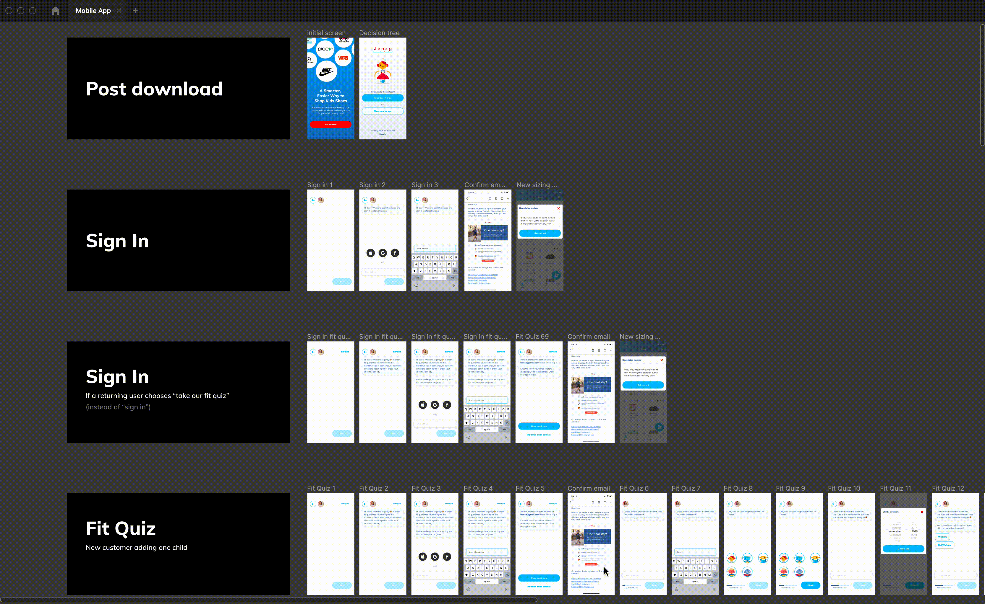
Solution & Optimizations
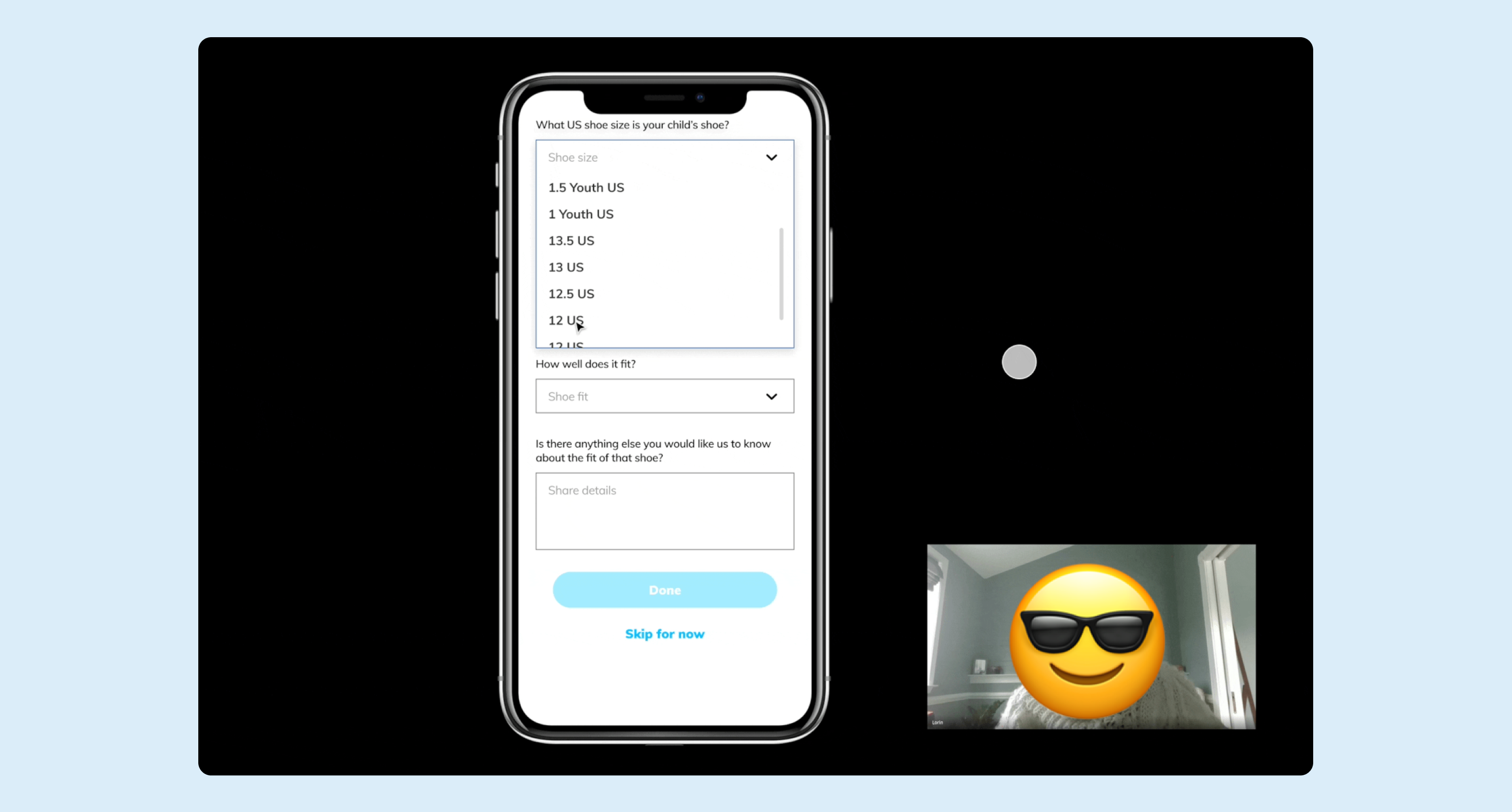
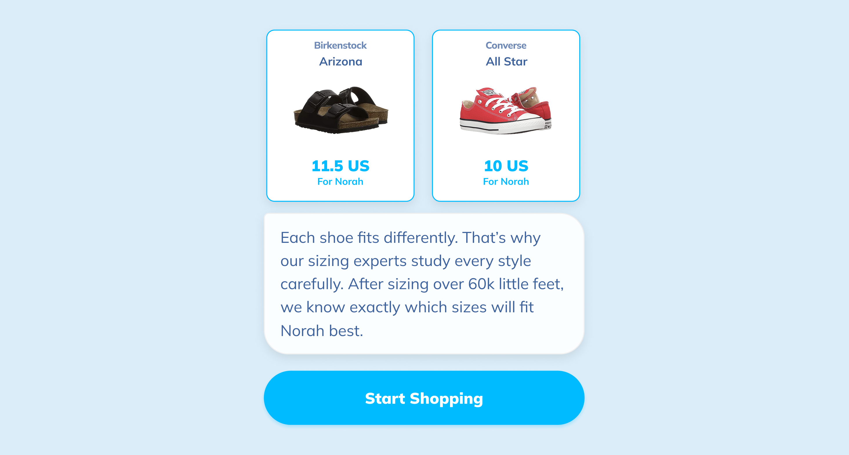
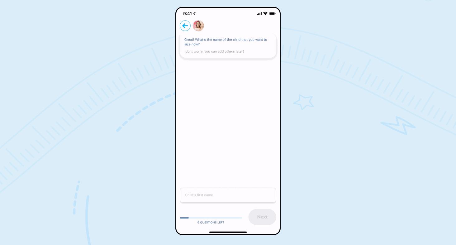
The primary solution was to replace the complicated photo flow with the simple quiz as the main sizing tool. To make the quiz feel intelligent and trustworthy, we optimized every step:
- Intuitive Language: Questions were phrased using parent-friendly language (e.g., "snug" vs. "narrow").
- Data-Driven Pacing: We adjusted the number of questions based on brand choice; if a user picked a brand, we'd prioritize Nike in subsequent brand lists. These micro-optimizations reduced completion time by up to a minute.
- Visual Feedback: Clear illustrations were used to make the process engaging and easy to understand.
Post-Launch Evolution
We created a continuous improvement system that turned insights into action. A shared Notion doc captured discoveries from Mixpanel metrics, customer calls, help desk tickets, and bug reports. Monthly reviews identified patterns. Quarterly planning sessions prioritized enhancements. Between major projects, we'd grab low-hanging fruit in quick sprints.
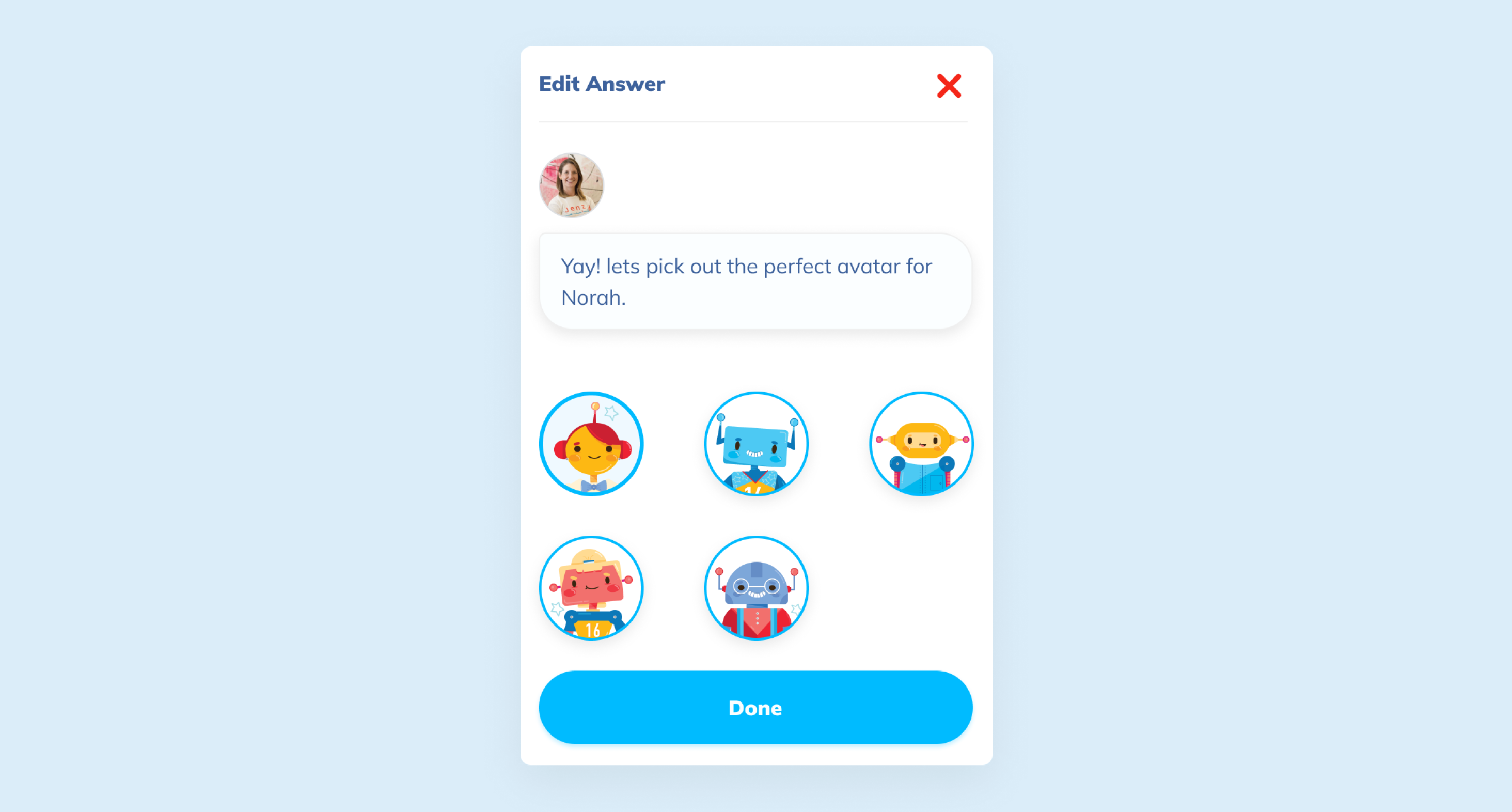
One example: some of our users expressed low confidence in the foot width question. We added visual guides showing the difference between narrow, regular, and wide feet using simple illustrations. Quiz completion increased. Size exchanges decreased. A two-day fix that had a meaningful impact!
Reflection
This project showed me that the simplest solution can outperform the flashy one. We ended up retiring the photo-taking method because parents could answer a few quick questions and get a more accurate result. The data made the choice obvious; the quiz was easier, faster, and way less frustrating.
The bigger takeaway was about meeting parents where they actually are. They didn't need AI to measure their kids' feet. They just needed a tool that backed up their instincts, like noticing when a shoe feels snug. By leaning into what parents already know and giving them confidence in it, the experience felt supportive instead of like another task on their to-do list.