SandboxVR
SandboxVR creates industry-leading virtual reality gaming experiences with zero lag and fully immersive environments. Their hundreds of on-site employees juggled three separate apps to navigate the customer experience from check-in to gameplay. I designed a unified app that made day-to-day operations seamless and worked around all the quirks that come with running a VR facility.
My role
Principal Designer leading end to end design, from user research through implementation. Conducted field studies, created the information architecture, contributed to the design system, and collaborated with the Hong Kong development team throughout the planning and build process.
Challenge
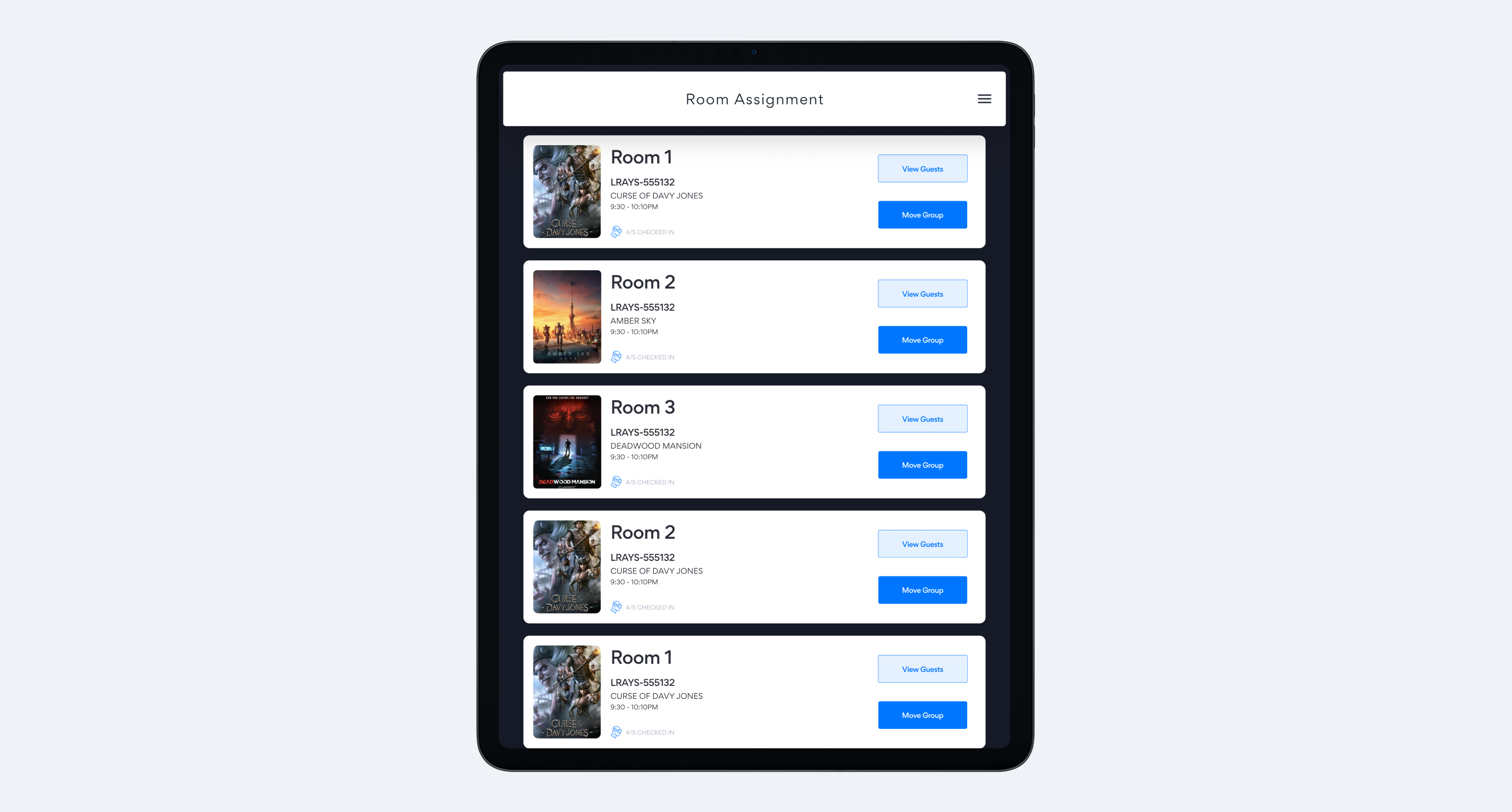
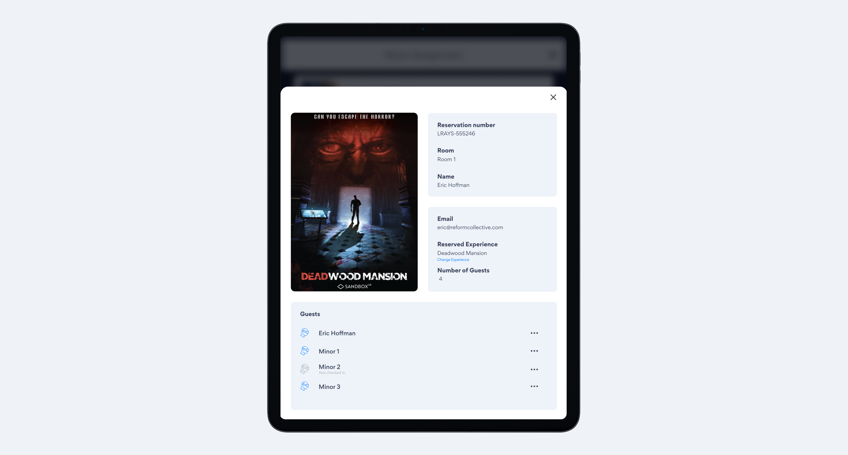
SandboxVR employees were constantly switching between two applications to manage basic tasks: moving groups between rooms, testing equipment, assigning avatars, and controlling game sessions. All the separate tools were slowing things down, making training harder, and causing way more room for mistakes. They needed one app that actually understood how the whole workflow fit together.
Research & Discovery
Weekly sessions with store manager Susan and her team revealed the hidden complexity of SandboxVR's facility operations. I conducted multiple employee exploration sessions, documenting:
- Context switches between apps (averaging 20+ per shift)
- Physical movement patterns through the facility
- Critical handoff points between team members
- Equipment troubleshooting workflows
Key insight
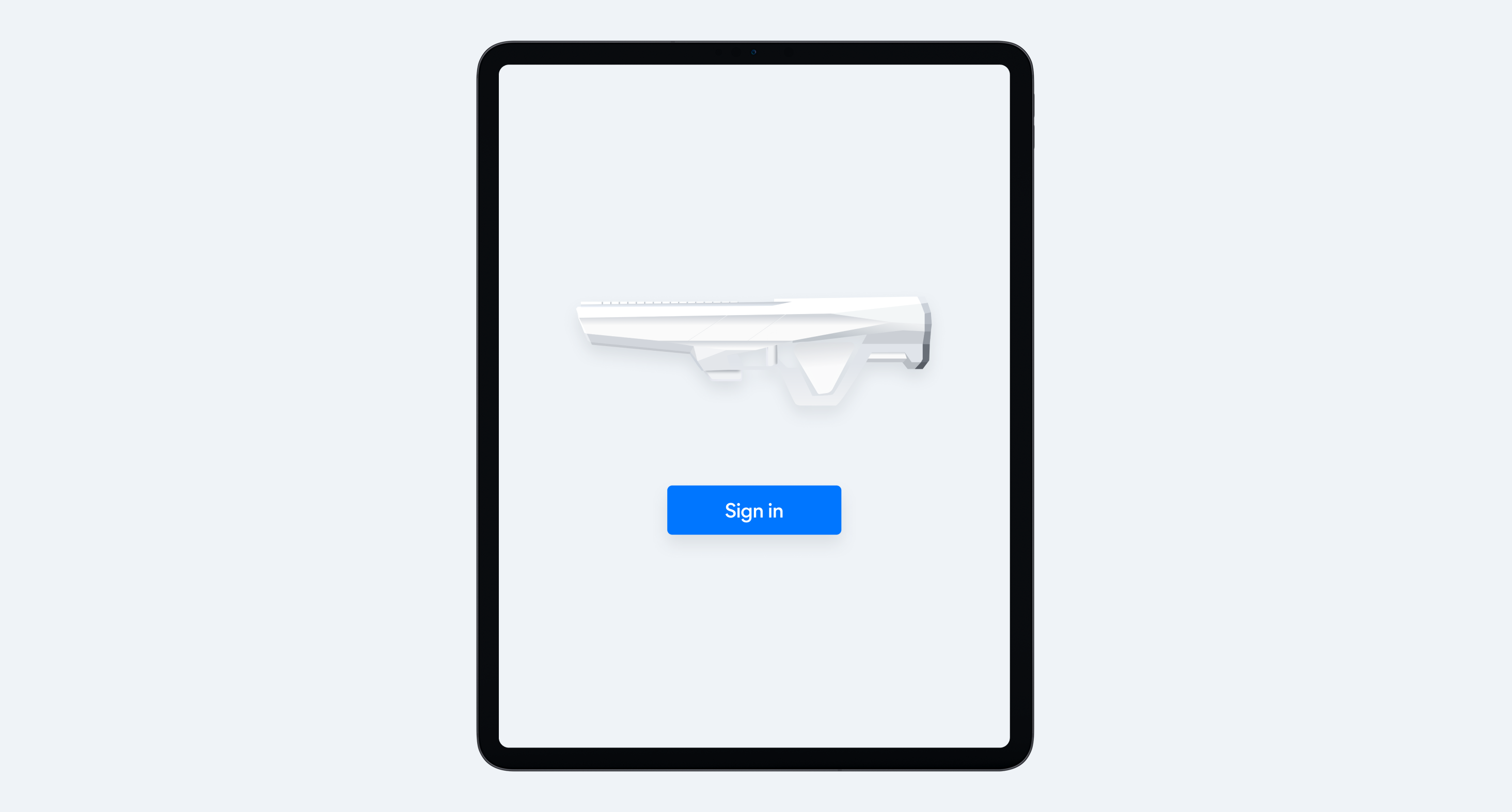
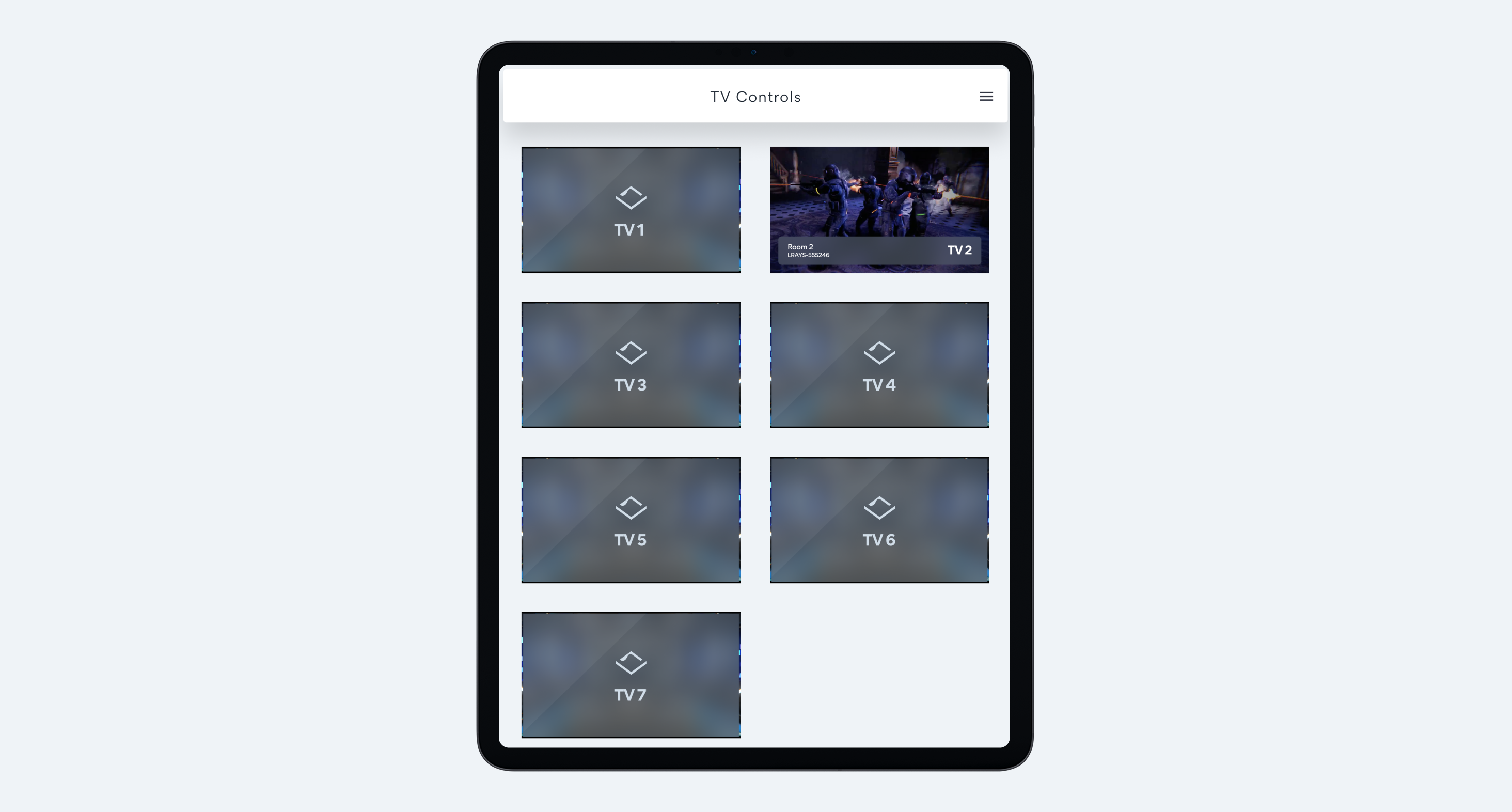
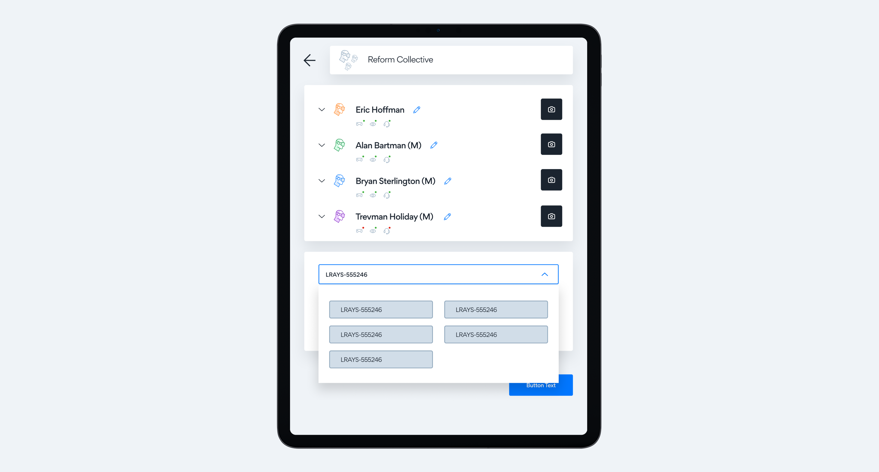
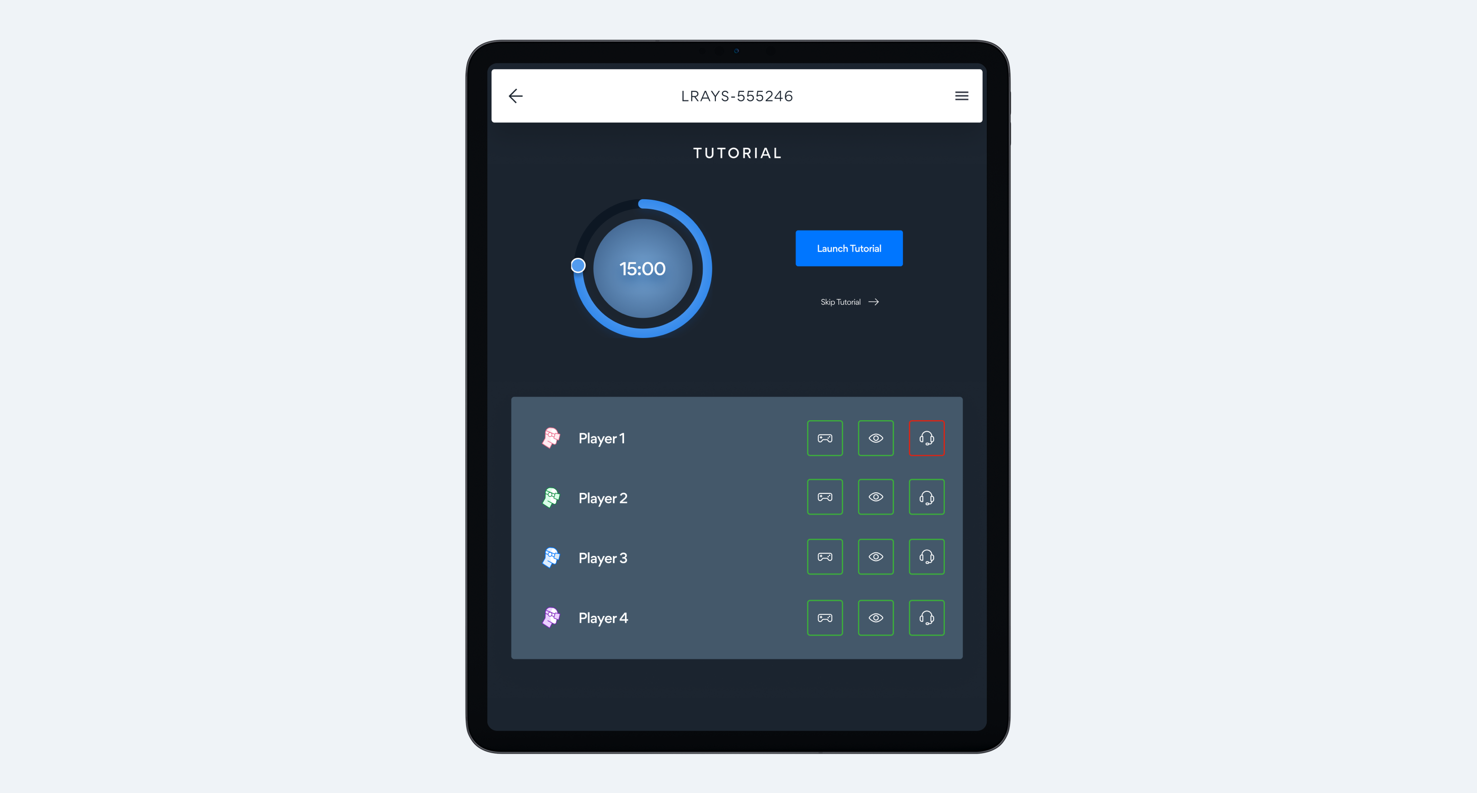
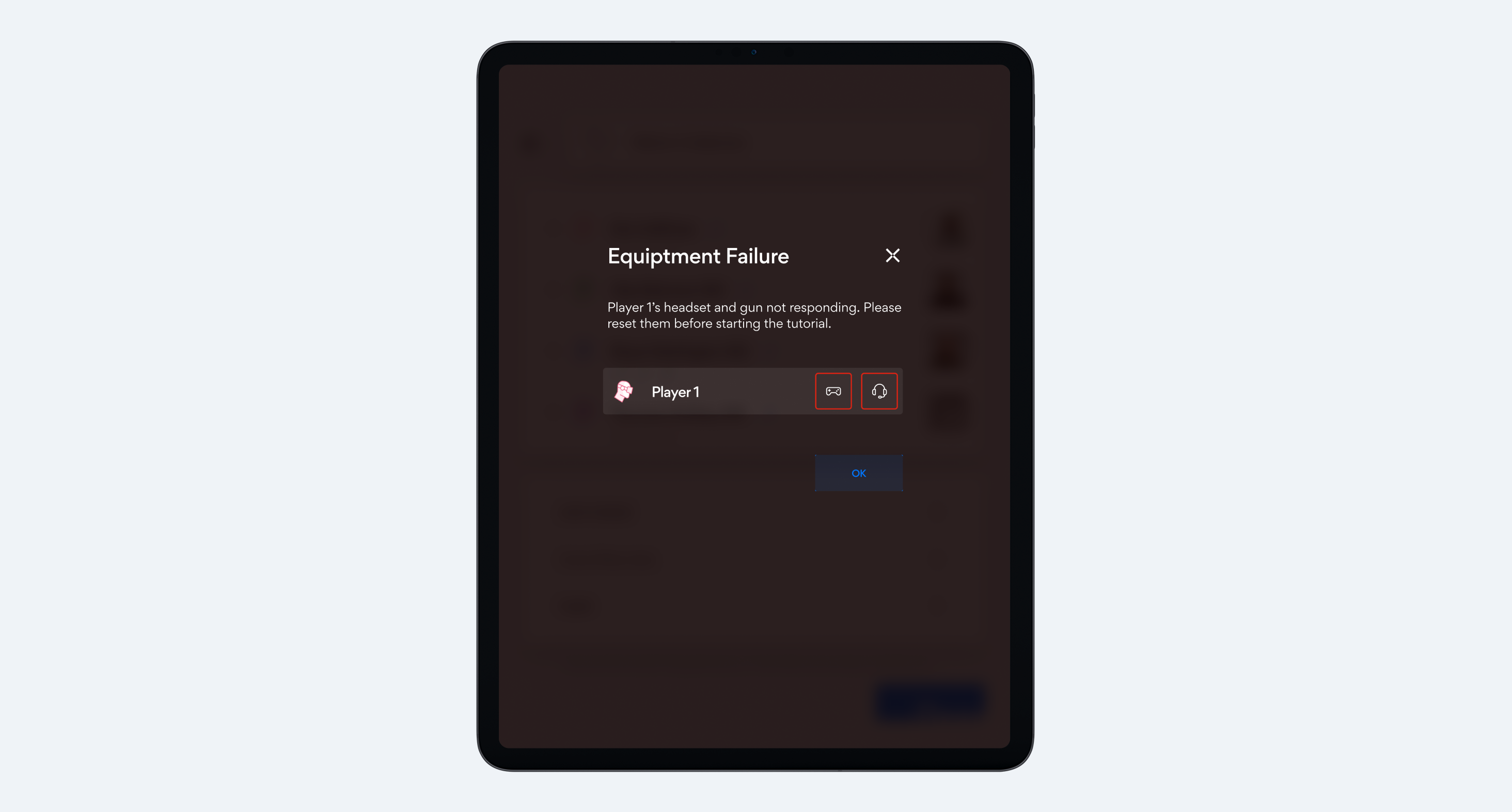
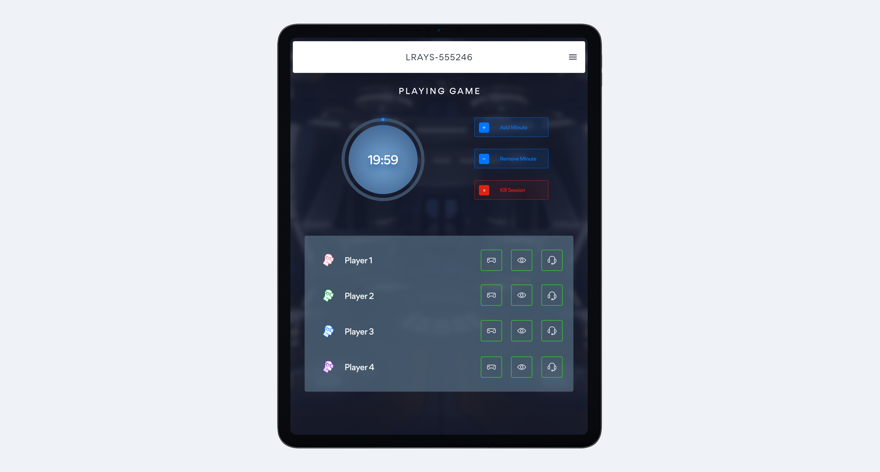
The lighting situation dictated how we needed to design each part of the workflow. Employees in the lobby needed an on brand, bright interface to help check groups in. This had to match the self service checkin screens for visual consistency. Once the groups had been checked in, the app now served as a control/troubleshooting device in the dimly lit game room.
Design solution
We solved the lighting challenge by designing each part of the flow based off where the employee would be using it. If they are in the lobby, the app is bright and matches the self checking screens. If the employee was in the game room, the app would be in dark mode ensuring that there are no light leaks.
To make this work, we extended SandboxVR's existing brand guidelines into a full component library where every single element was designed twice, once for light mode, once for dark. This meant:
- Touch targets sized for employees using tablets while standing and moving
- Multiple contrast states tested under different lighting conditions
- Progressive disclosure patterns to keep complex operations manageable on smaller screens
- Consistent visual language that felt cohesive despite the mode differences
The result was a design system that adapted to the physical space rather than fighting against it. Employees could move seamlessly between areas without the interface becoming a barrier to their work.
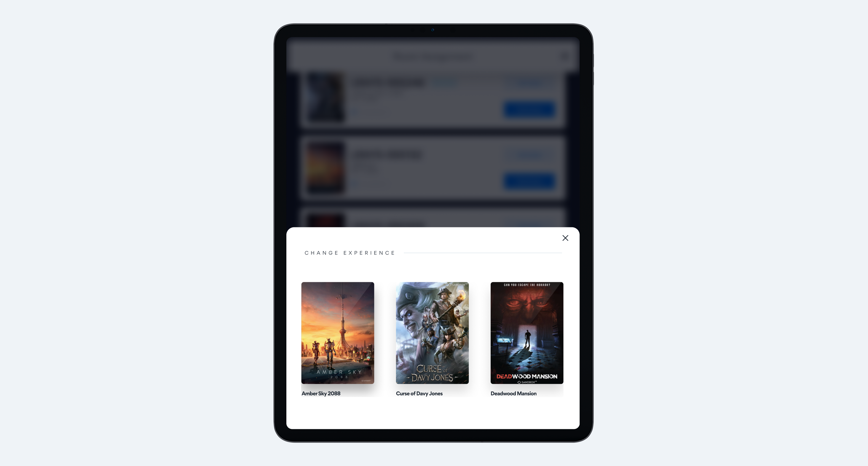
Adaptive Workflows & Technical Constraints
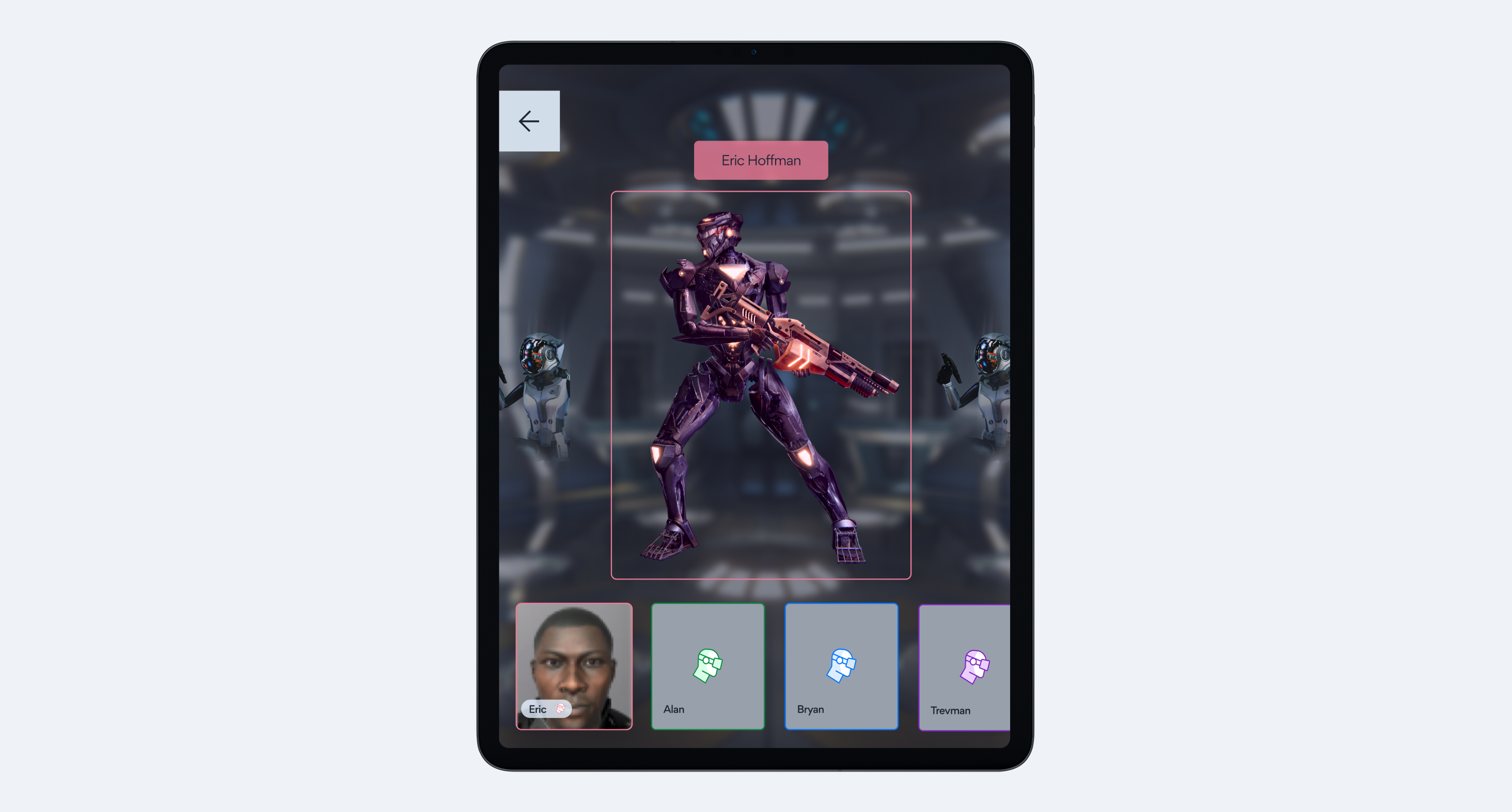
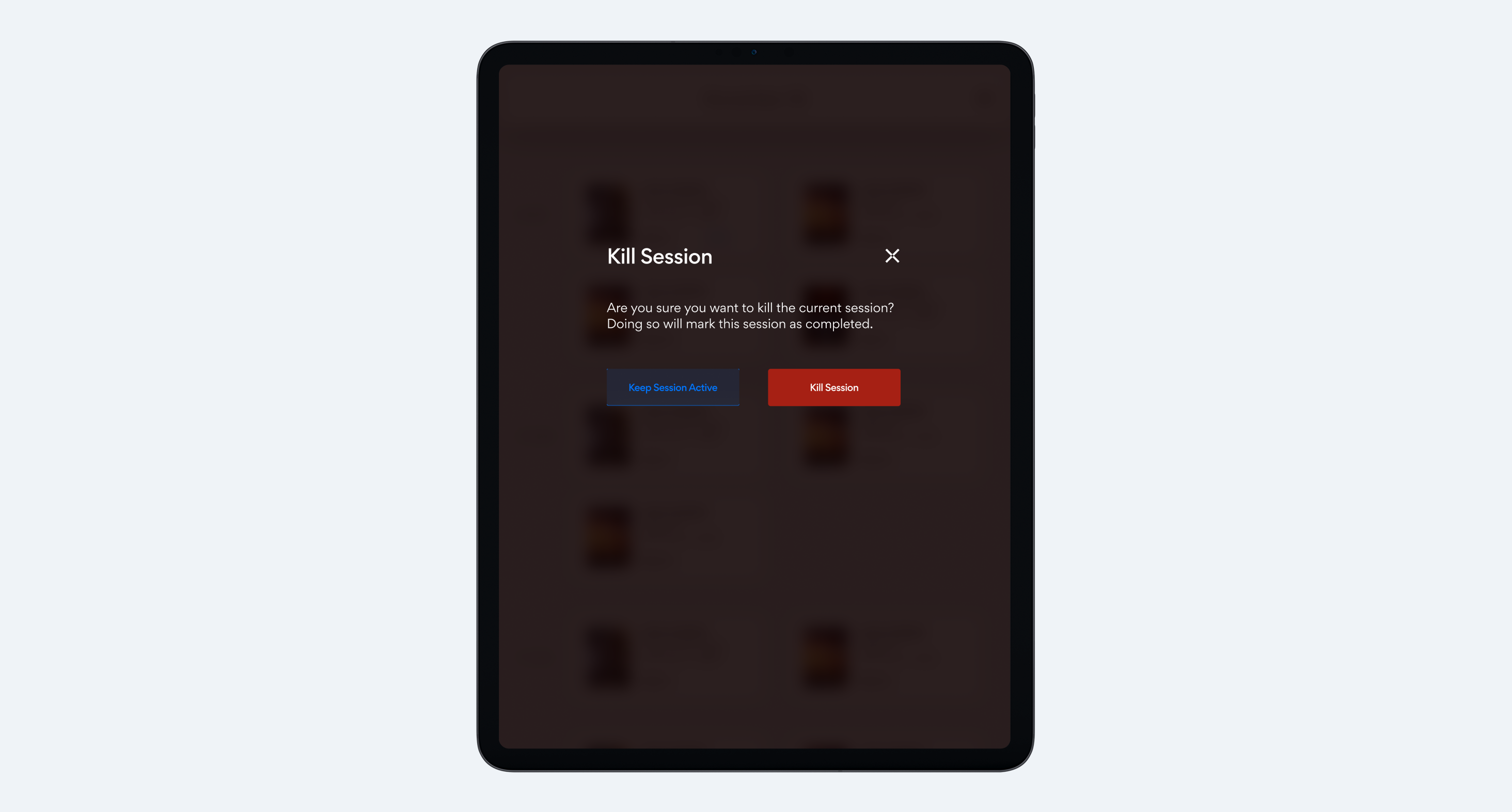
The PWA framework eliminated native functionality we'd typically rely on, forcing us to completely rethink core interactions. Drag-and-drop wasn't possible, so we rebuilt group management from scratch using tap to select patterns with clear visual states and contextual menus. What seemed like a limitation actually led to a better solution, our sequential tap interface ended up being a more elegant solution than dragging and dropping. We validated every new interaction pattern through iterative testing with actual employees. Critical actions got multi-step confirmations to prevent mistakes during busy periods, and we made sure efficiency wasn't sacrificed despite the technical constraints.
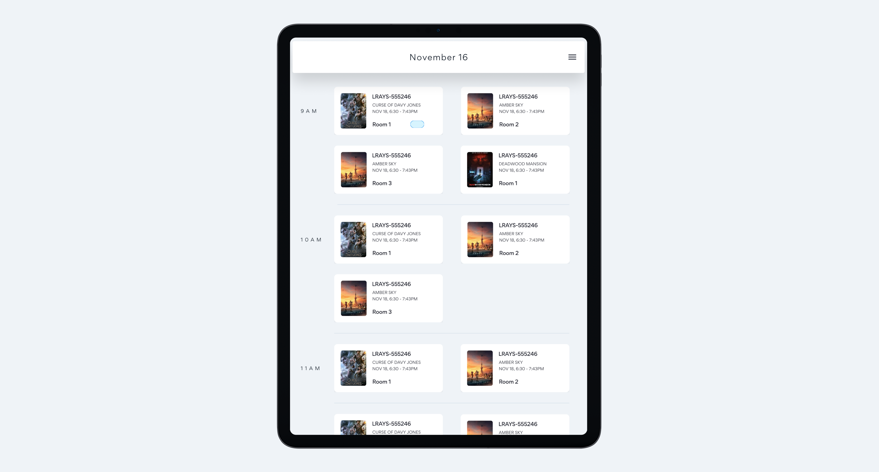
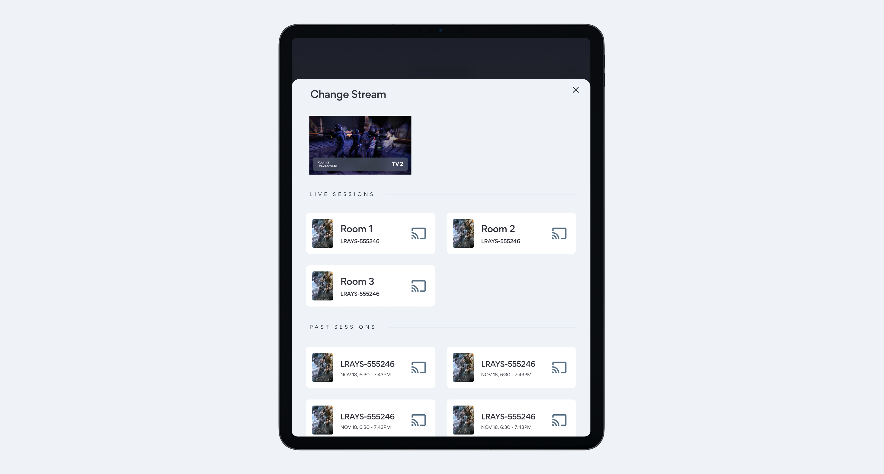
The video rendering system presented another challenge. High volume processing meant frequent render failures, and while the real fix needed to happen on the backend, business timelines meant we had to solve it through design:
- Clear retry mechanisms with status indicators showing exactly what went wrong
- Fallback options so employees could keep moving even when renders failed
- Queue visibility letting staff prioritize tasks and work around bottlenecks
Process Highlights
Susan helped me test everything in the actual facilities, starting with low-fidelity wireframes that employees could react to in real world conditions. When PWA constraints killed our original interaction patterns, we pivoted fast, sometimes redesigning entire workflows overnight based on what we learned. The rollout was deliberately cautious: beta testing with employees who could handle the rough edges before pushing to all locations.
Working with the Hong Kong development team meant getting creative with asynchronous collaboration. I recorded interaction demos for every component since written specs alone wouldn't cut it across language and time zone barriers. We structured our feedback loops around their schedule:
- Detailed specifications with screen recordings showing exact interactions
- Documentation in multiple formats to prevent misinterpretation
- Comments and revisions timed for their morning standup
Reflection
My core lesson from this project is that constraints can function as very effective design parameters. What began as a limiting set of PWA restrictions forced us to develop solutions that surpassed our original concepts. The necessity of removing drag and drop, for instance, led us to a superior and faster tap based interface.
The most significant learning curve involved prioritizing context. Success depended on truly understanding the real world operational factors: the lighting, the flow of activity, and the high pressure nature of a busy afternoon. Designing specifically for the actual environment was the factor that led to a successful outcome.